MailerLite
MailerLite
MailerLite
MailerLite
ROLE / SERVICES
Design & Development
Project type
Design challenge
COMPANY & location
MailerLite / Europe
ROLE / SERVICES
Design & Development
Project type
Design challenge
COMPANY & location
MailerLite / Europe
ROLE / SERVICES
Design & Development
Project type
Design challenge
COMPANY & location
MailerLite / Europe
ROLE / SERVICES
Design & Development
Project type
Design challenge
COMPANY & location
MailerLite / Europe
INTRODUCTION
INTRODUCTION
INTRODUCTION
INTRODUCTION
A design challenge created by the company MailerLite. This was the second step in the hiring process. The purpose of the challenge was, so they could see my design and development skills and understand my process.
A design challenge created by the company MailerLite. This was the second step in the hiring process. The purpose of the challenge was, so they could see my design and development skills and understand my process.
A design challenge created by the company MailerLite. This was the second step in the hiring process. The purpose of the challenge was, so they could see my design and development skills and understand my process.
A design challenge created by the company MailerLite. This was the second step in the hiring process. The purpose of the challenge was, so they could see my design and development skills and understand my process.
MilerLite is an email marketing and automation platform. It's designed to help businesses and individuals create, manage, and send email marketing campaigns, newsletters, and other email communications.
MilerLite is an email marketing and automation platform. It's designed to help businesses and individuals create, manage, and send email marketing campaigns, newsletters, and other email communications.
MilerLite is an email marketing and automation platform. It's designed to help businesses and individuals create, manage, and send email marketing campaigns, newsletters, and other email communications.
MilerLite is an email marketing and automation platform. It's designed to help businesses and individuals create, manage, and send email marketing campaigns, newsletters, and other email communications.
The requirements
The requirements
The requirements
The requirements
Create a one-page landing page design to promote and sell the top 10 books of your choice. The genre of the books is up to you. The design should be visually appealing, user-friendly, and enticing to potential book buyers. The landing page should share the same branding as MailerLite, but it could be improved.
Create a one-page landing page design to promote and sell the top 10 books of your choice. The genre of the books is up to you. The design should be visually appealing, user-friendly, and enticing to potential book buyers. The landing page should share the same branding as MailerLite, but it could be improved.
Create a one-page landing page design to promote and sell the top 10 books of your choice. The genre of the books is up to you. The design should be visually appealing, user-friendly, and enticing to potential book buyers. The landing page should share the same branding as MailerLite, but it could be improved.
Create a one-page landing page design to promote and sell the top 10 books of your choice. The genre of the books is up to you. The design should be visually appealing, user-friendly, and enticing to potential book buyers. The landing page should share the same branding as MailerLite, but it could be improved.
Deliverable
Deliverable
Explain your decisions.
Provide a link to a GitHub repository with the project files (HTML and CSS).
Host the final result on a platform of your choice (e.g., GitHub Pages, Netlify, etc.) and provide the link.
Design mockups (e.g., Figma, Sketch) and share the internal link for review.
Explain your decisions.
Provide a link to a GitHub repository with the project files (HTML and CSS).
Host the final result on a platform of your choice (e.g., GitHub Pages, Netlify, etc.) and provide the link.
Design mockups (e.g., Figma, Sketch) and share the internal link for review.
BONUS
BONUS
Write clean, semantic HTML code following best practices without using frontend frameworks.
Create a responsive design that adapts well to different screen sizes (desktop, tablet, and mobile).
Implement CSS animations or transitions to enhance the user experience, if desired.
Write clean, semantic HTML code following best practices without using frontend frameworks.
Create a responsive design that adapts well to different screen sizes (desktop, tablet, and mobile).
Implement CSS animations or transitions to enhance the user experience, if desired.

01
01
01
01
/
/
/
/
Research
Research
Research
Research
INVESTIGATION
INVESTIGATION
INVESTIGATION
INVESTIGATION
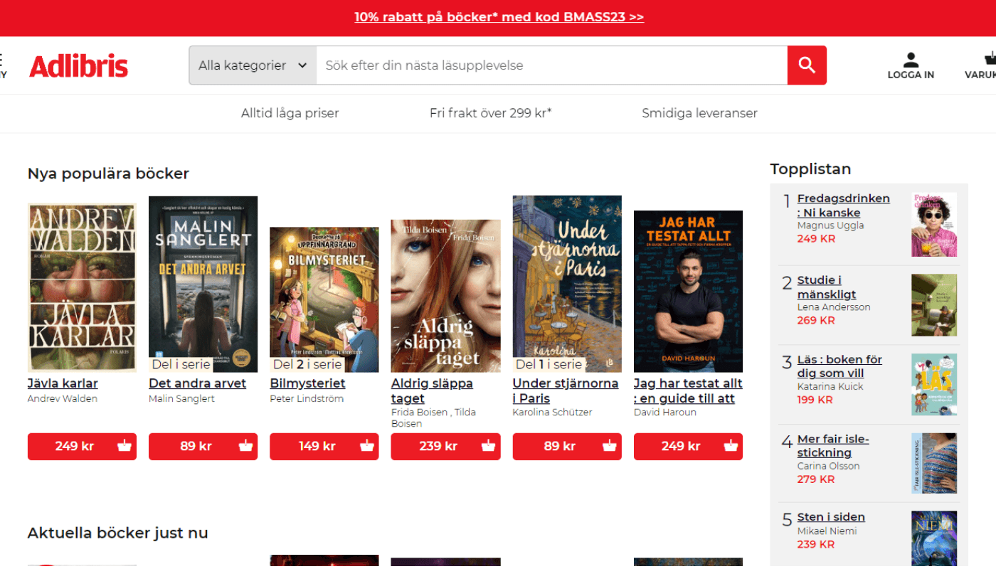
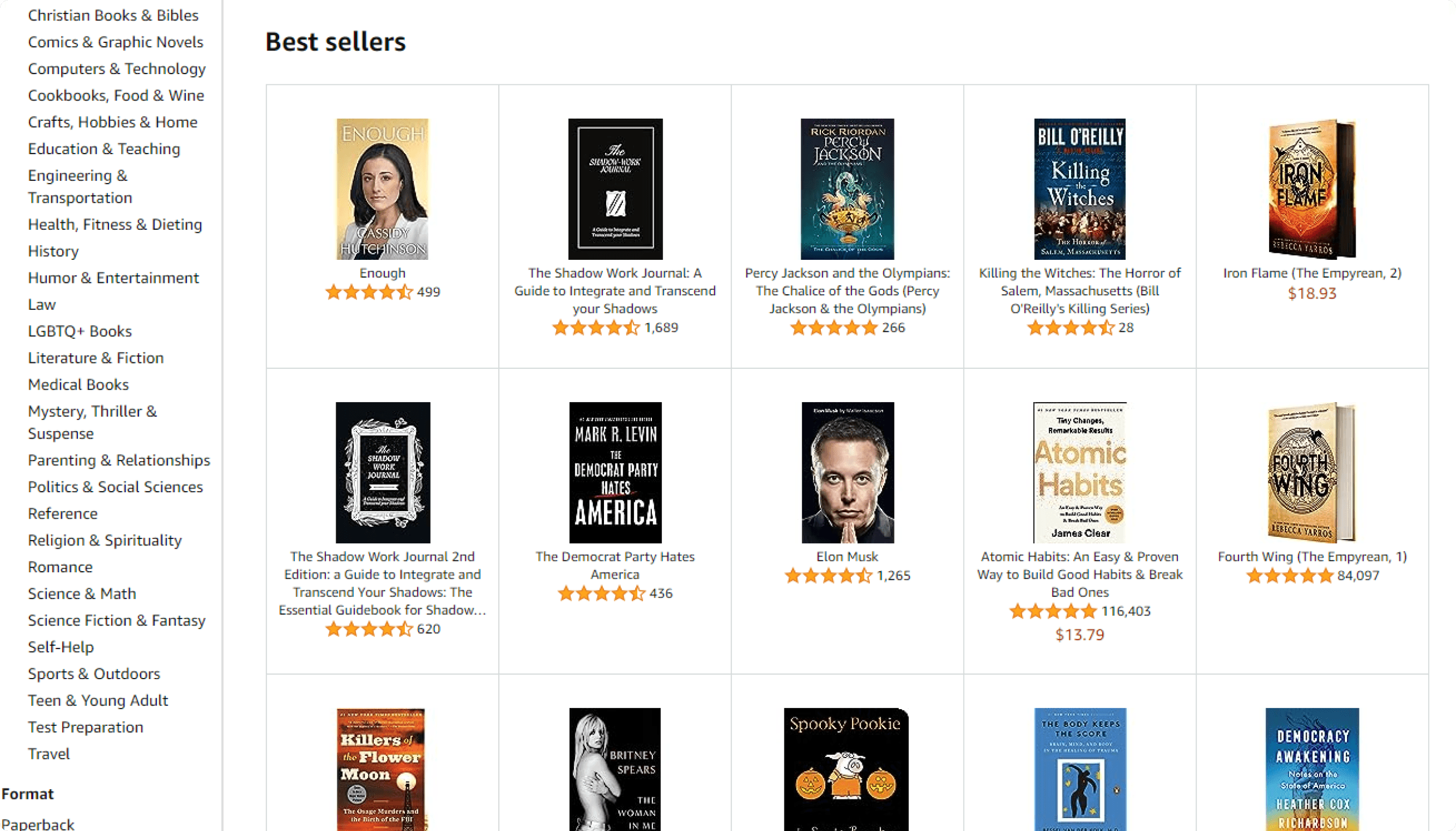
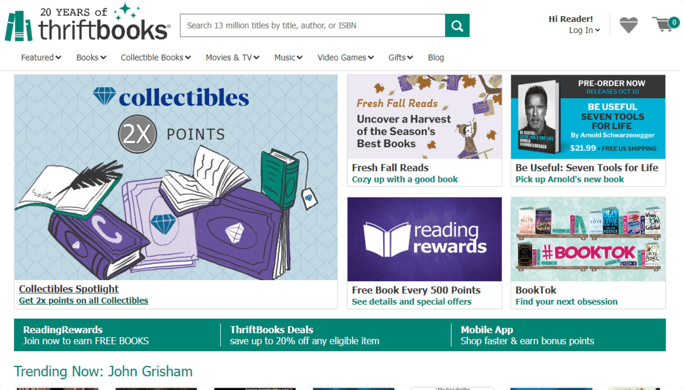
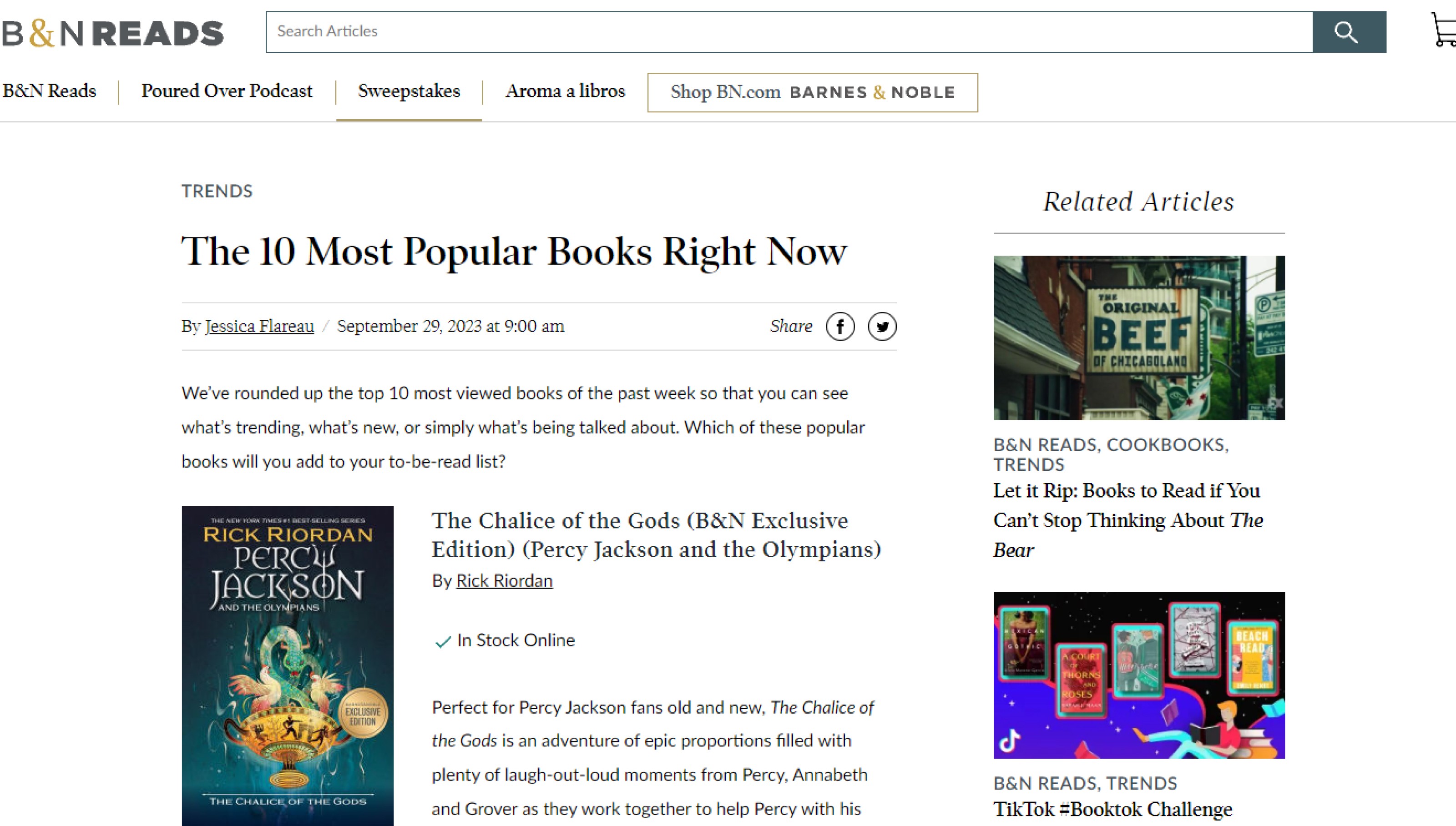
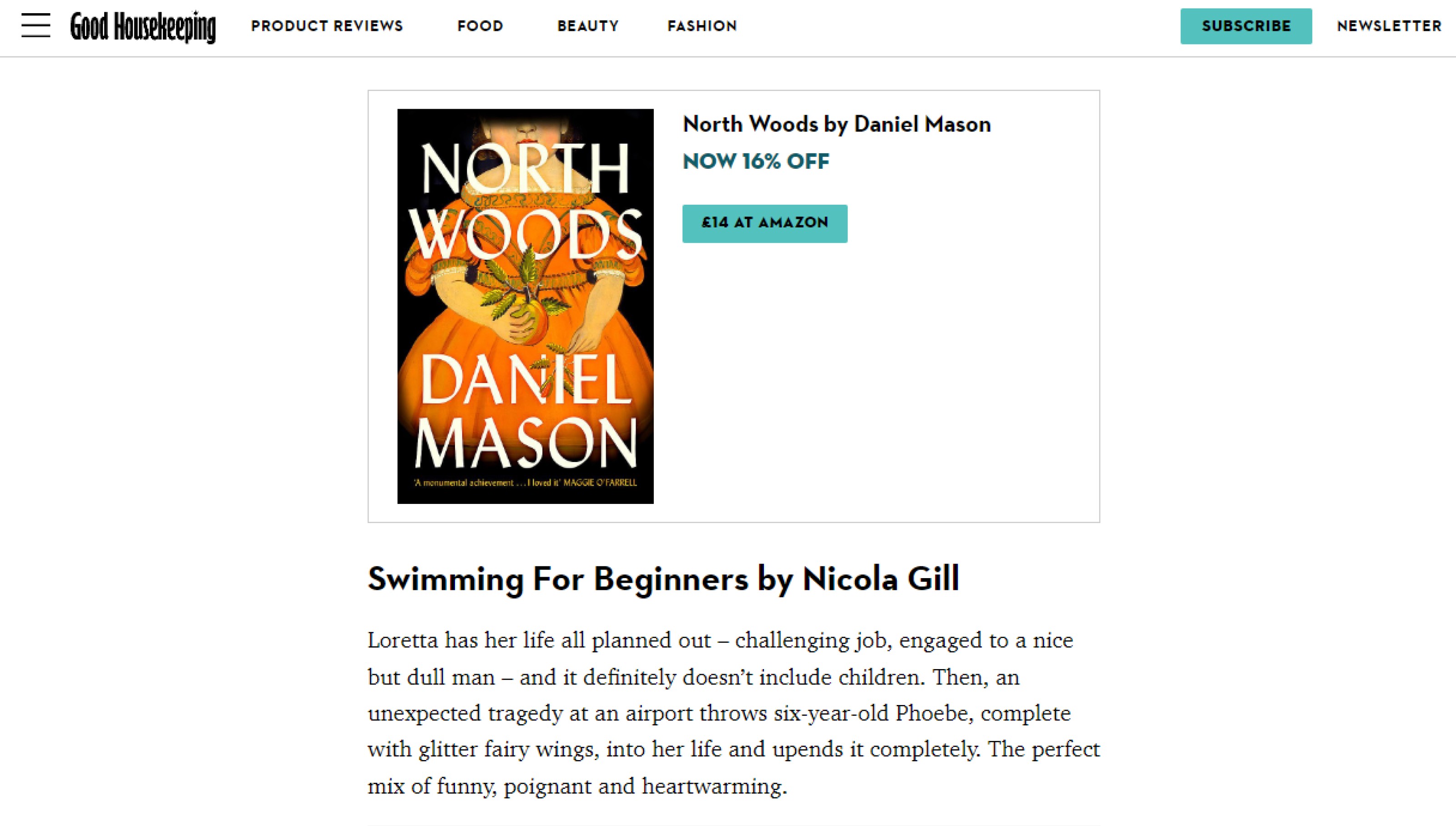
To learn more about how websites advertise and display books on their UI, I took the time to investigate some of the most popular online book stores. There were three that stood out.
To learn more about how websites advertise and display books on their UI, I took the time to investigate some of the most popular online book stores. There were three that stood out.
To learn more about how websites advertise and display books on their UI, I took the time to investigate some of the most popular online book stores. There were three that stood out.
To learn more about how websites advertise and display books on their UI, I took the time to investigate some of the most popular online book stores. There were three that stood out.
I took the time to look around each store and compare similarities in the information they displayed about each book and how they did it. Some of them had lists of top sellers, trends, and deals, which was really helpful.
I took the time to look around each store and compare similarities in the information they displayed about each book and how they did it. Some of them had lists of top sellers, trends, and deals, which was really helpful.
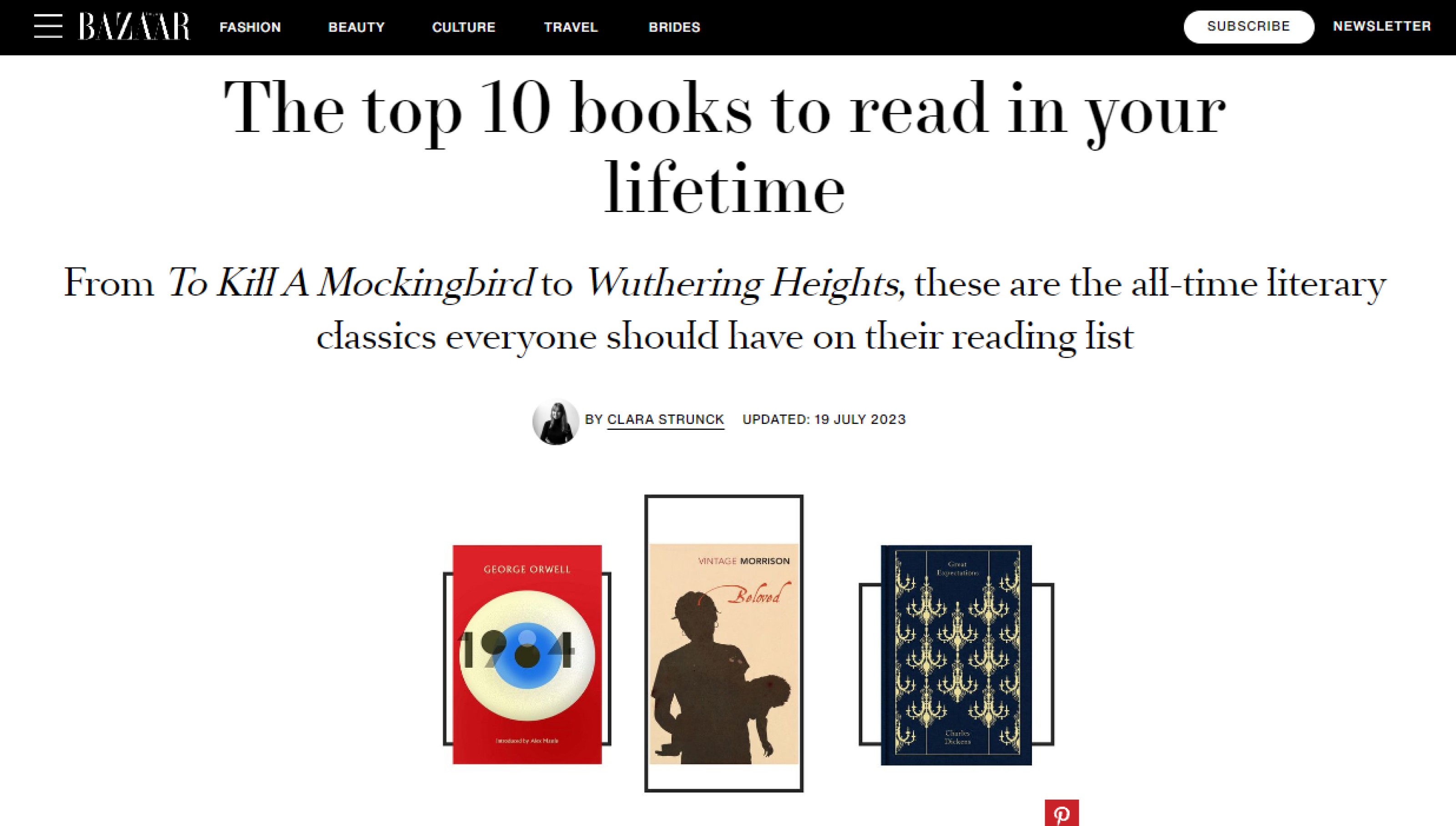
However, none of the websites had a dedicated landing page for a top 10 list of books. Therefore, I decided to explore specifically websites that had a top 10 list of books and see how they displayed the content, how the UI looked in terms of aesthetics, and what key elements they had to make the user feel engaged and interested. I also landed on three websites.
However, none of the websites had a dedicated landing page for a top 10 list of books. Therefore, I decided to explore specifically websites that had a top 10 list of books and see how they displayed the content, how the UI looked in terms of aesthetics, and what key elements they had to make the user feel engaged and interested. I also landed on three websites.
However, none of the websites had a dedicated landing page for a top 10 list of books. Therefore, I decided to explore specifically websites that had a top 10 list of books and see how they displayed the content, how the UI looked in terms of aesthetics, and what key elements they had to make the user feel engaged and interested. I also landed on three websites.
However, none of the websites had a dedicated landing page for a top 10 list of books. Therefore, I decided to explore specifically websites that had a top 10 list of books and see how they displayed the content, how the UI looked in terms of aesthetics, and what key elements they had to make the user feel engaged and interested. I also landed on three websites.
For the most part, the information between the web stores was very similar:
For the most part, the information between the web stores was very similar:
For the most part, the information between the web stores was very similar:
For the most part, the information between the web stores was very similar:
Book cover.
Title.
Author.
Price.
CTA to add to cart.
Book cover.
Title.
Author.
Price.
CTA to add to cart.
This was also true for the top ten lists, the only addition was that they had a brief introduction to the book. This I found very interesting because now the user has a way to know a bit more about the book, and it could ultimately create curiosity towards the book.
Another thing that I found very useful was that on Amazon there was a star rating for each book, and it was the only website out of the bunch that had it. I thought it was brilliant. There's an article about a study conducted by emplifi, that says:
Another thing that I found very useful was that on Amazon there was a star rating for each book, and it was the only website out of the bunch that had it. I thought it was brilliant. There's an article about a study conducted by emplifi, that says:
Another thing that I found very useful was that on Amazon there was a star rating for each book, and it was the only website out of the bunch that had it. I thought it was brilliant. There's an article about a study conducted by emplifi, that says:
Another thing that I found very useful was that on Amazon there was a star rating for each book, and it was the only website out of the bunch that had it. I thought it was brilliant. There's an article about a study conducted by emplifi, that says:
- “Customer reviews/ratings are the most influential factor in purchasing decisions outranking price, return policy, and shipping costs.”
- “Customer reviews/ratings are the most influential factor in purchasing decisions outranking price, return policy, and shipping costs.”
This is a tiny but useful feature that improves the chances of a user potentially buying one of the books from the website.
This is a tiny but useful feature that improves the chances of a user potentially buying one of the books from the website.
Lastly, I decided to create a list of what key elements were going to be displayed for each book according to the information gathered from the research.
Lastly, I decided to create a list of what key elements were going to be displayed for each book according to the information gathered from the research.
Lastly, I decided to create a list of what key elements were going to be displayed for each book according to the information gathered from the research.
Lastly, I decided to create a list of what key elements were going to be displayed for each book according to the information gathered from the research.
Book cover.
Title.
Author.
Rating.
Introduction to the book.
CTA to add to cart.
Book cover.
Title.
Author.
Rating.
Introduction to the book.
CTA to add to cart.

02
02
02
02
/
/
/
/
Designing
Designing
Designing
Designing
style guide
style guide
style guide
style guide
The tool of choice for me is Figma. It's the design software that I have the most experience using (4 years).
The tool of choice for me is Figma. It's the design software that I have the most experience using (4 years).
The tool of choice for me is Figma. It's the design software that I have the most experience using (4 years).
The tool of choice for me is Figma. It's the design software that I have the most experience using (4 years).
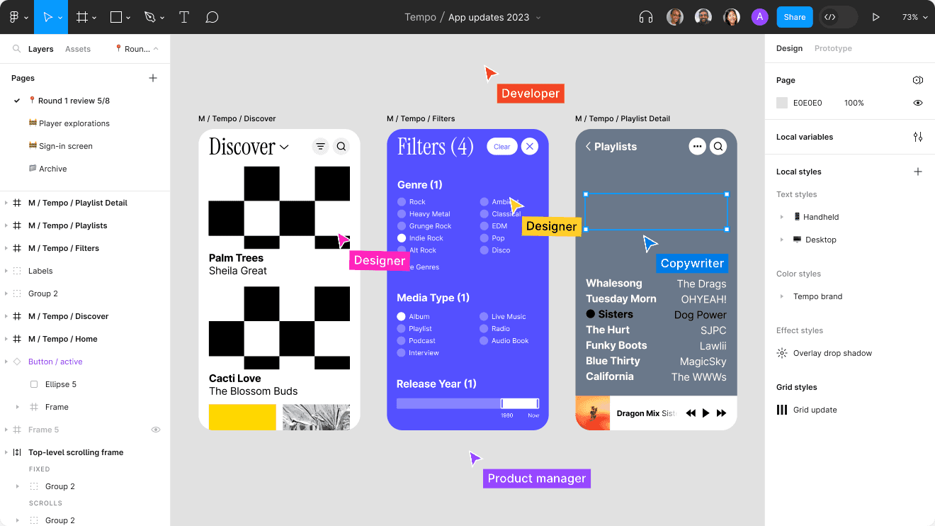
Mailer emphasized in the requirements for the challenge that the landing page has to share the same branding as MailerLite. So in order to create a landing page that looked and felt organic, it was necessary to take the time to view their website and get to know some of their design patterns, colors, typography, and shadows, among other design elements.
Mailer emphasized in the requirements for the challenge that the landing page has to share the same branding as MailerLite. So in order to create a landing page that looked and felt organic, it was necessary to take the time to view their website and get to know some of their design patterns, colors, typography, and shadows, among other design elements.
Mailer emphasized in the requirements for the challenge that the landing page has to share the same branding as MailerLite. So in order to create a landing page that looked and felt organic, it was necessary to take the time to view their website and get to know some of their design patterns, colors, typography, and shadows, among other design elements.
Mailer emphasized in the requirements for the challenge that the landing page has to share the same branding as MailerLite. So in order to create a landing page that looked and felt organic, it was necessary to take the time to view their website and get to know some of their design patterns, colors, typography, and shadows, among other design elements.
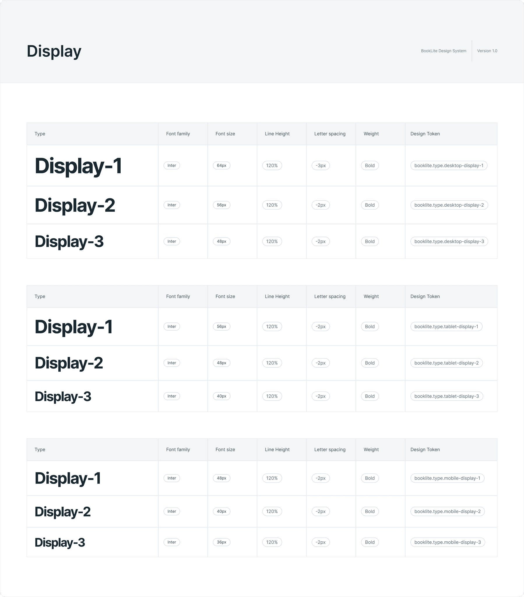
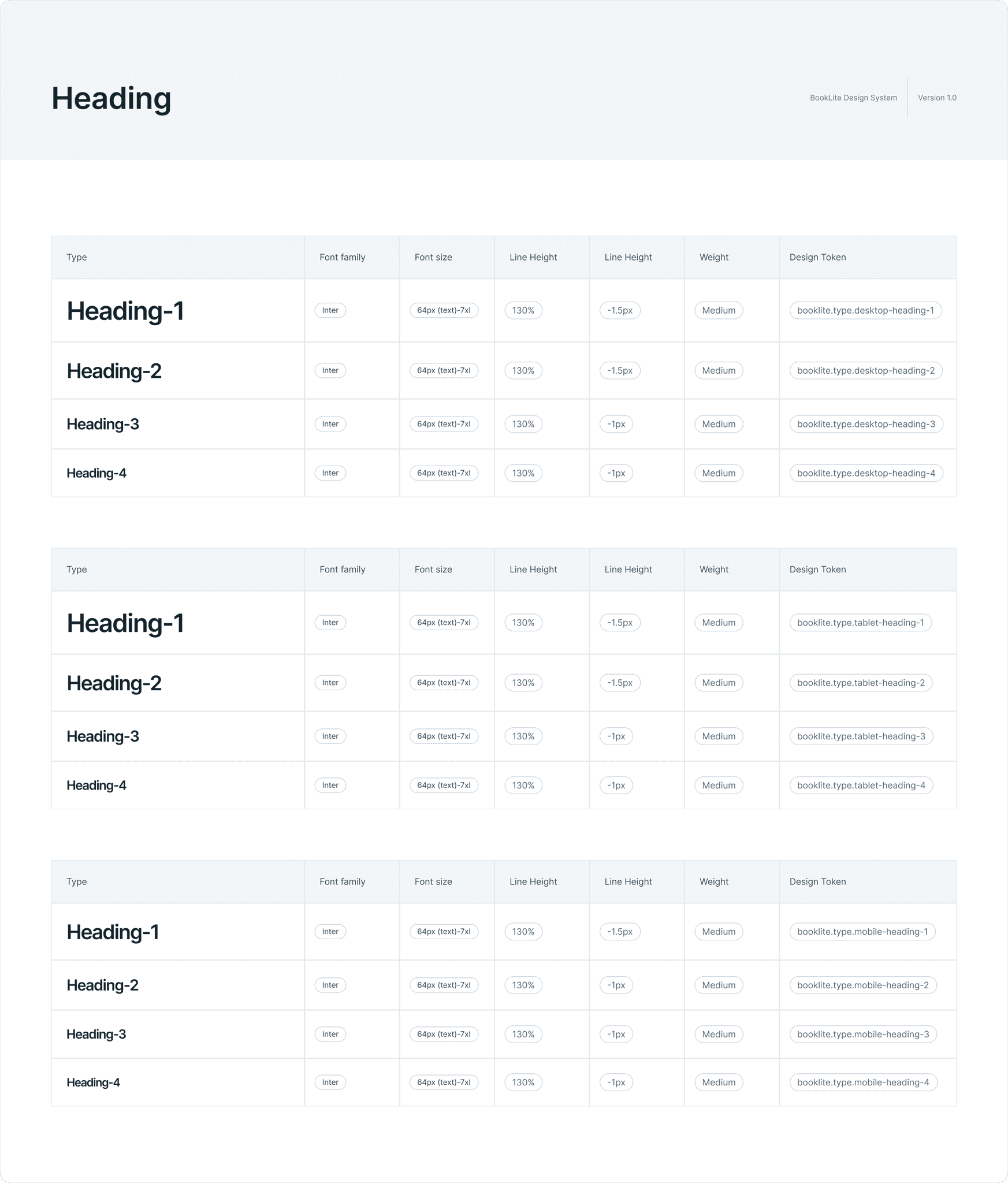
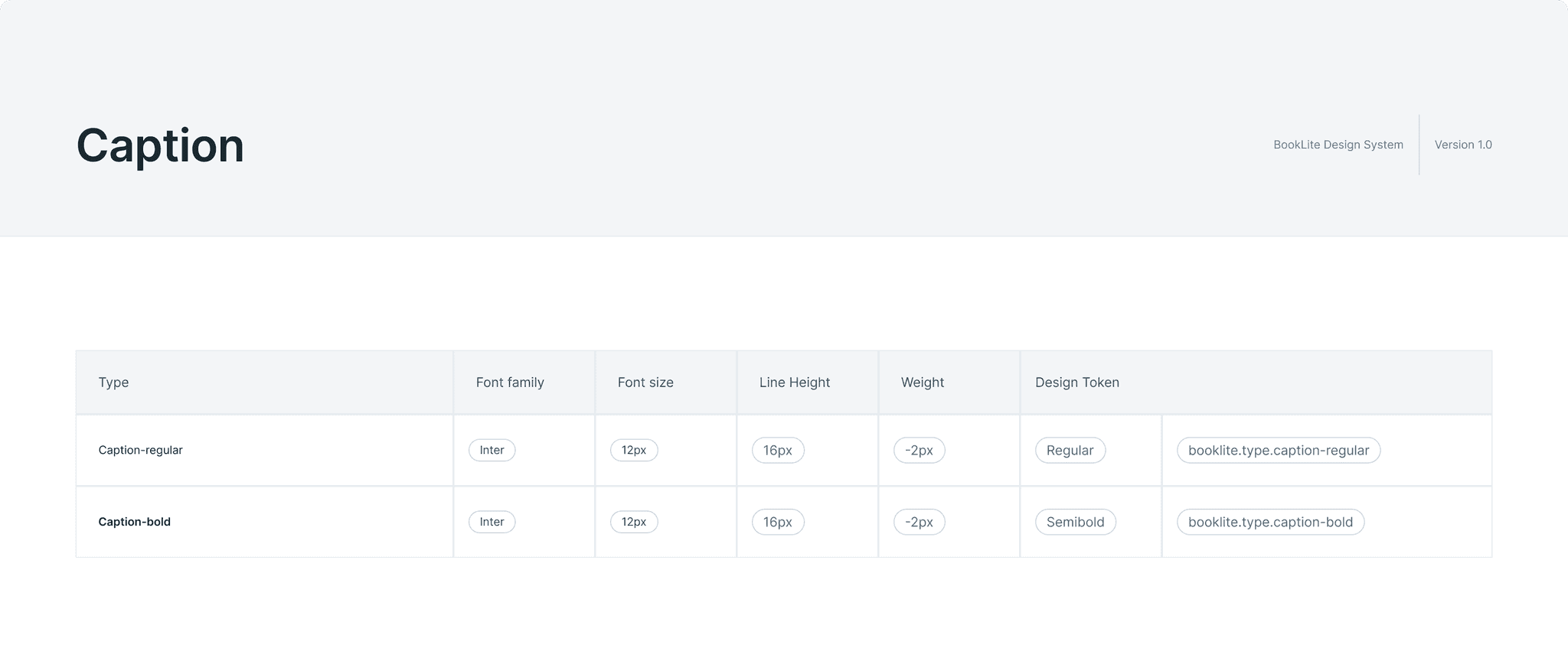
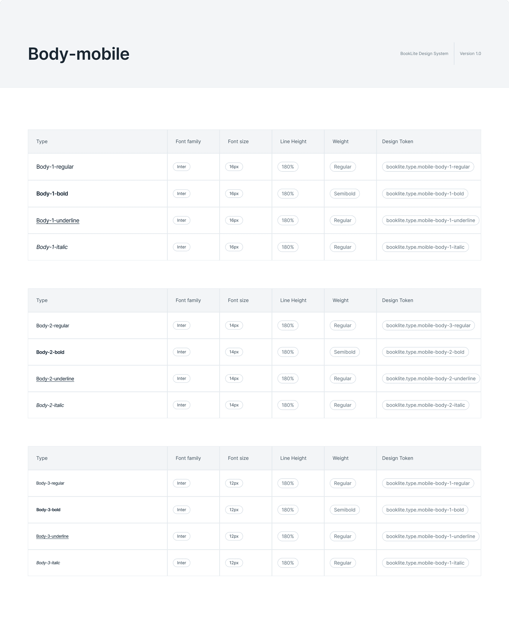
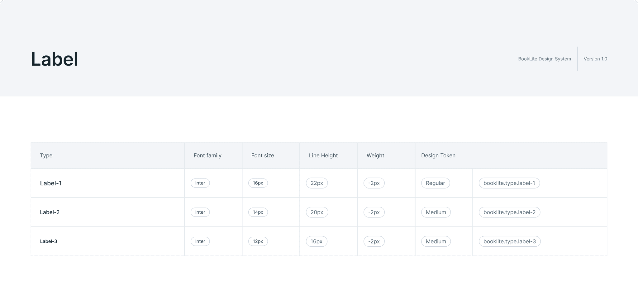
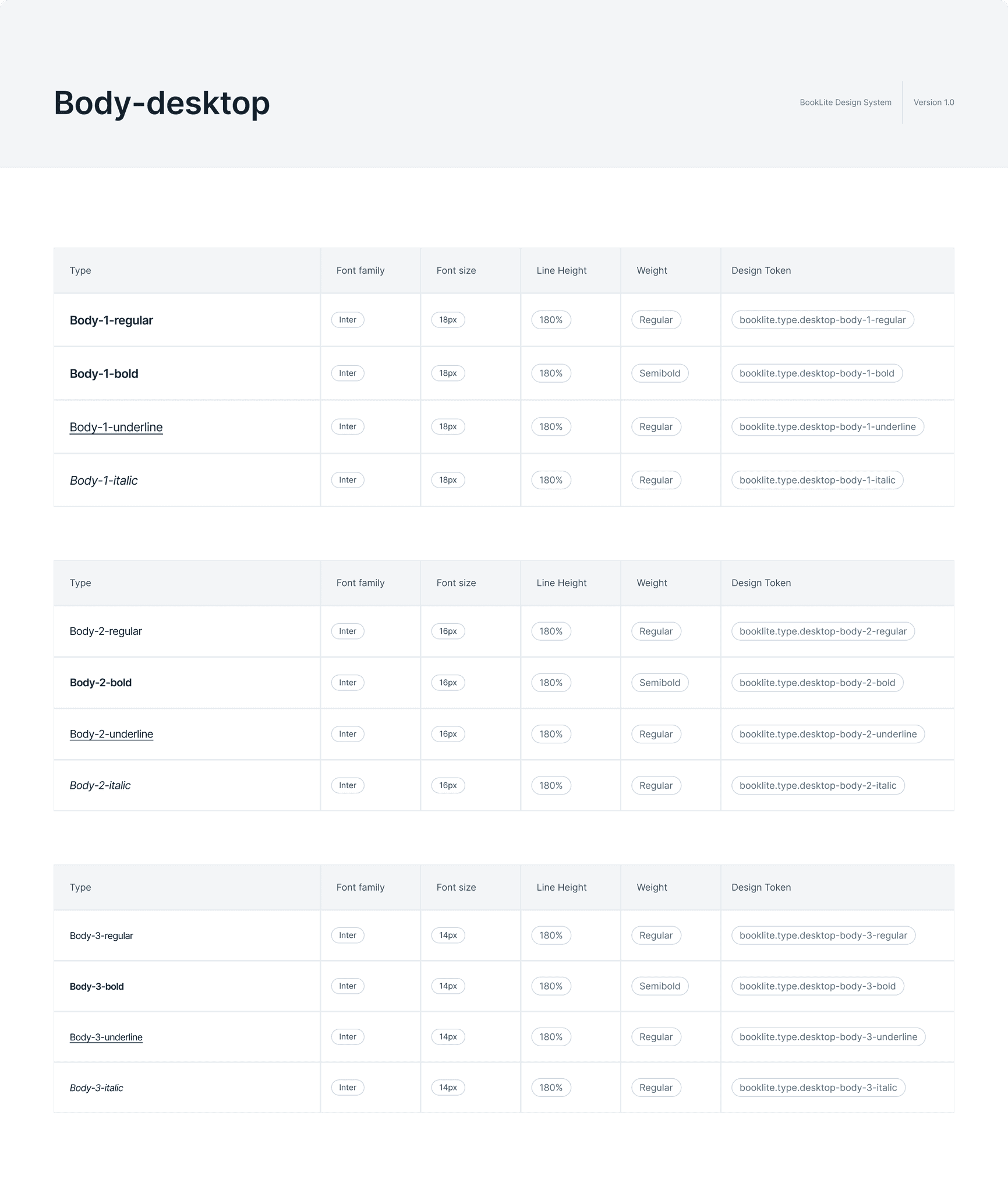
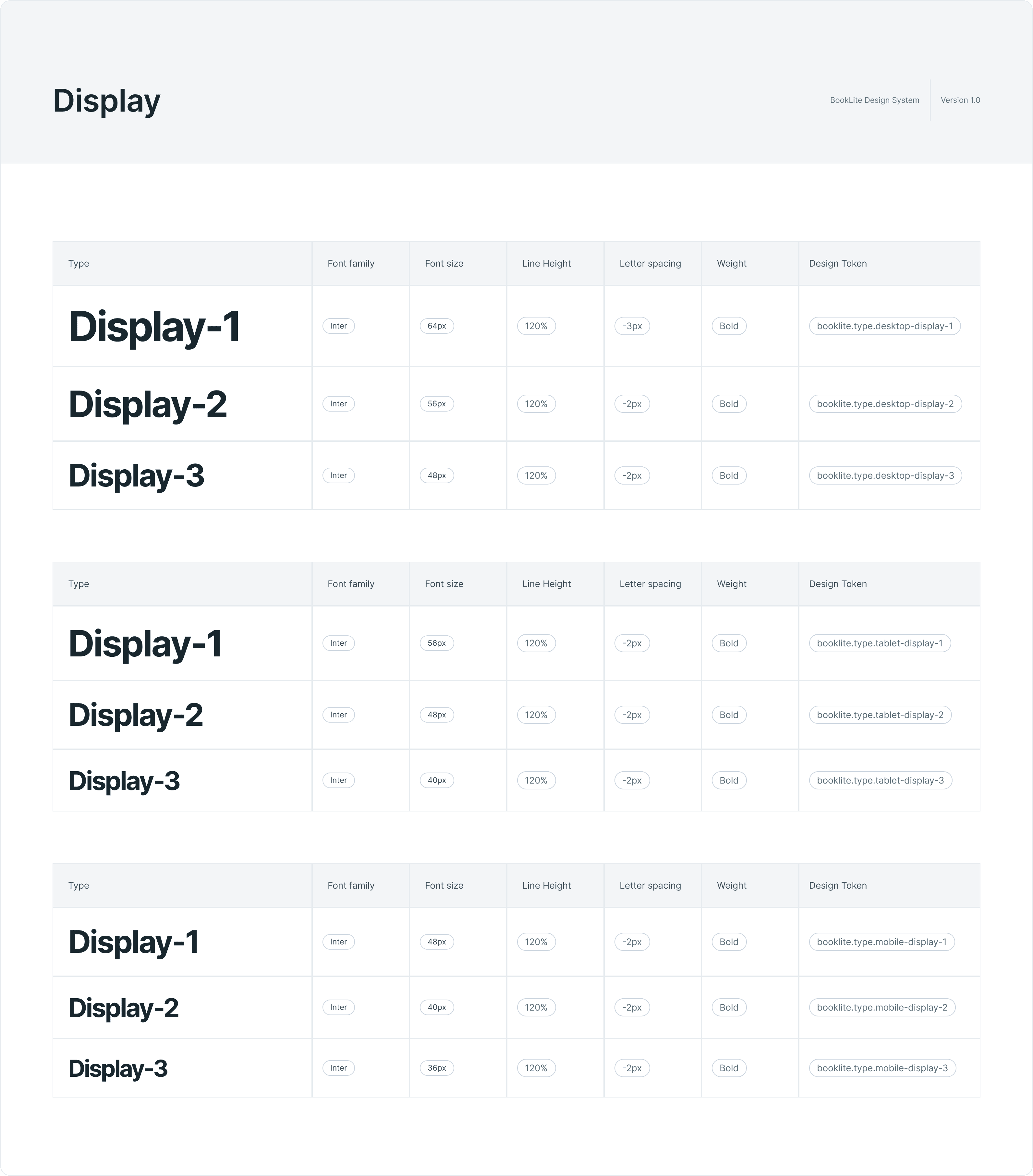
To accomplish this, I used the DevTools from the browser to view details of the elements that otherwise I would not be able to know. Like the font face, letter spacing, line height and size from the typography, the hex value of the colors, box shadow, border radius of certain elements, etc.
To accomplish this, I used the DevTools from the browser to view details of the elements that otherwise I would not be able to know. Like the font face, letter spacing, line height and size from the typography, the hex value of the colors, box shadow, border radius of certain elements, etc.
To accomplish this, I used the DevTools from the browser to view details of the elements that otherwise I would not be able to know. Like the font face, letter spacing, line height and size from the typography, the hex value of the colors, box shadow, border radius of certain elements, etc.
To accomplish this, I used the DevTools from the browser to view details of the elements that otherwise I would not be able to know. Like the font face, letter spacing, line height and size from the typography, the hex value of the colors, box shadow, border radius of certain elements, etc.
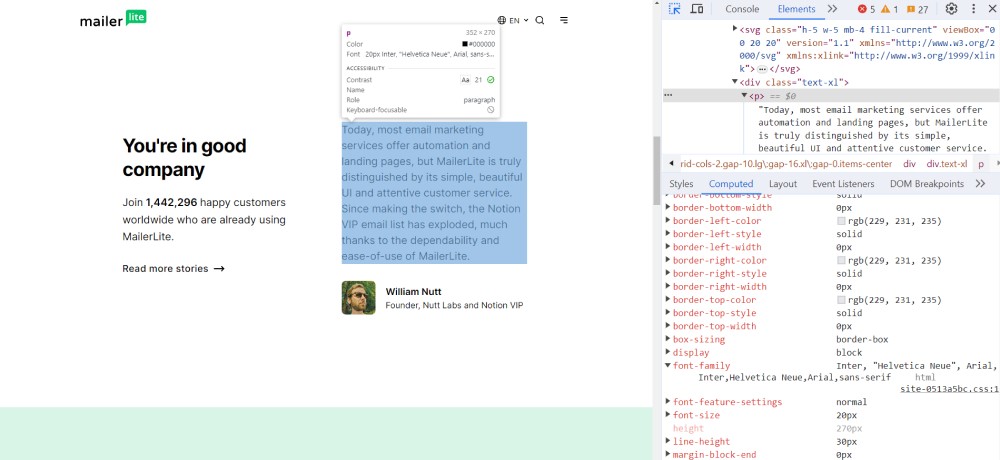
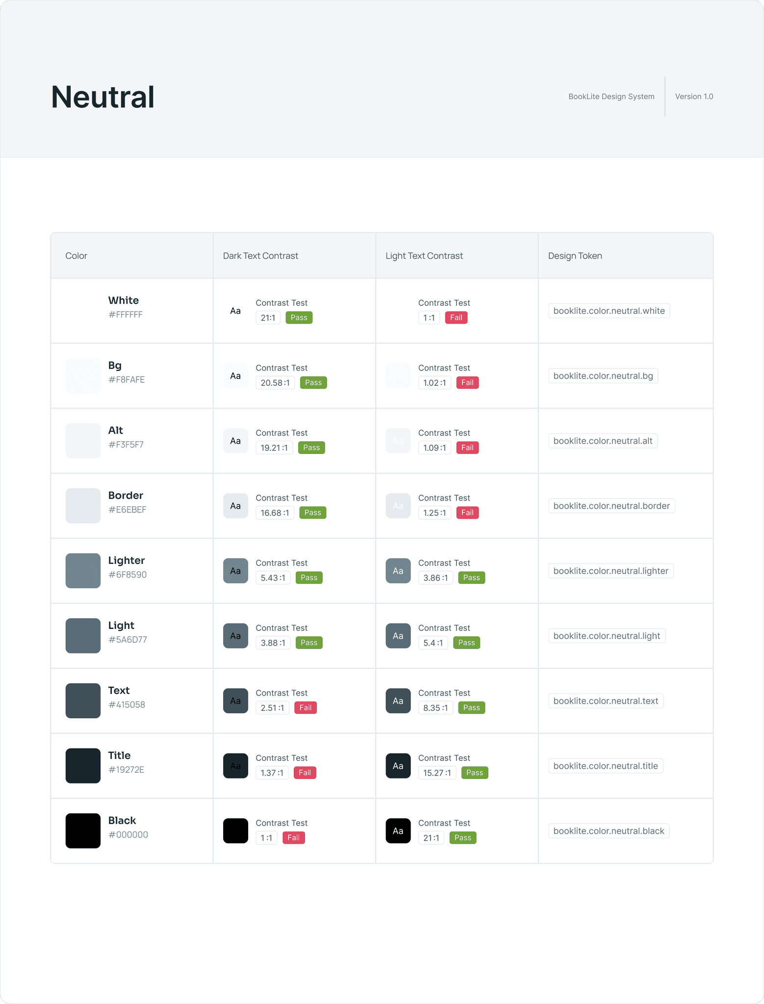
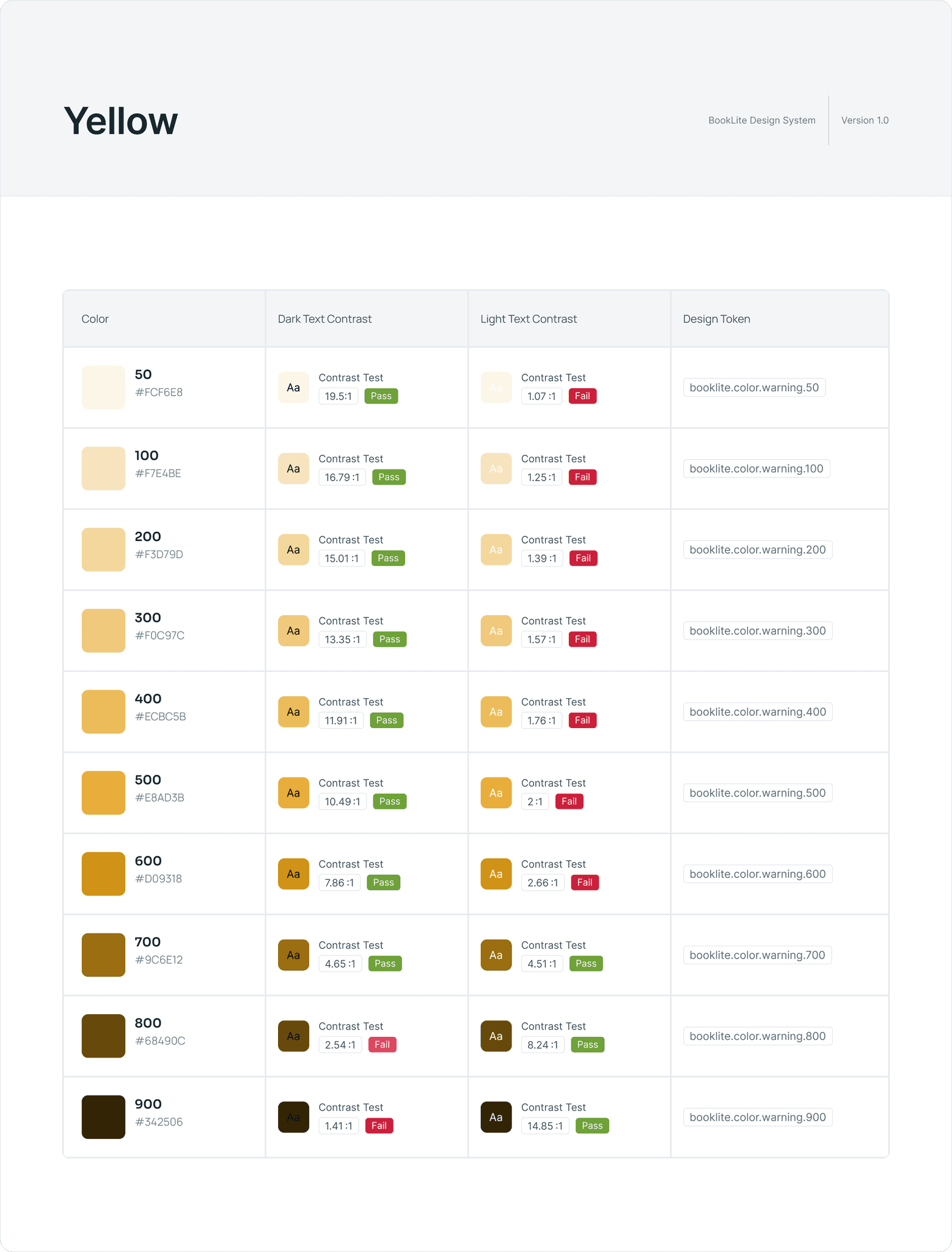
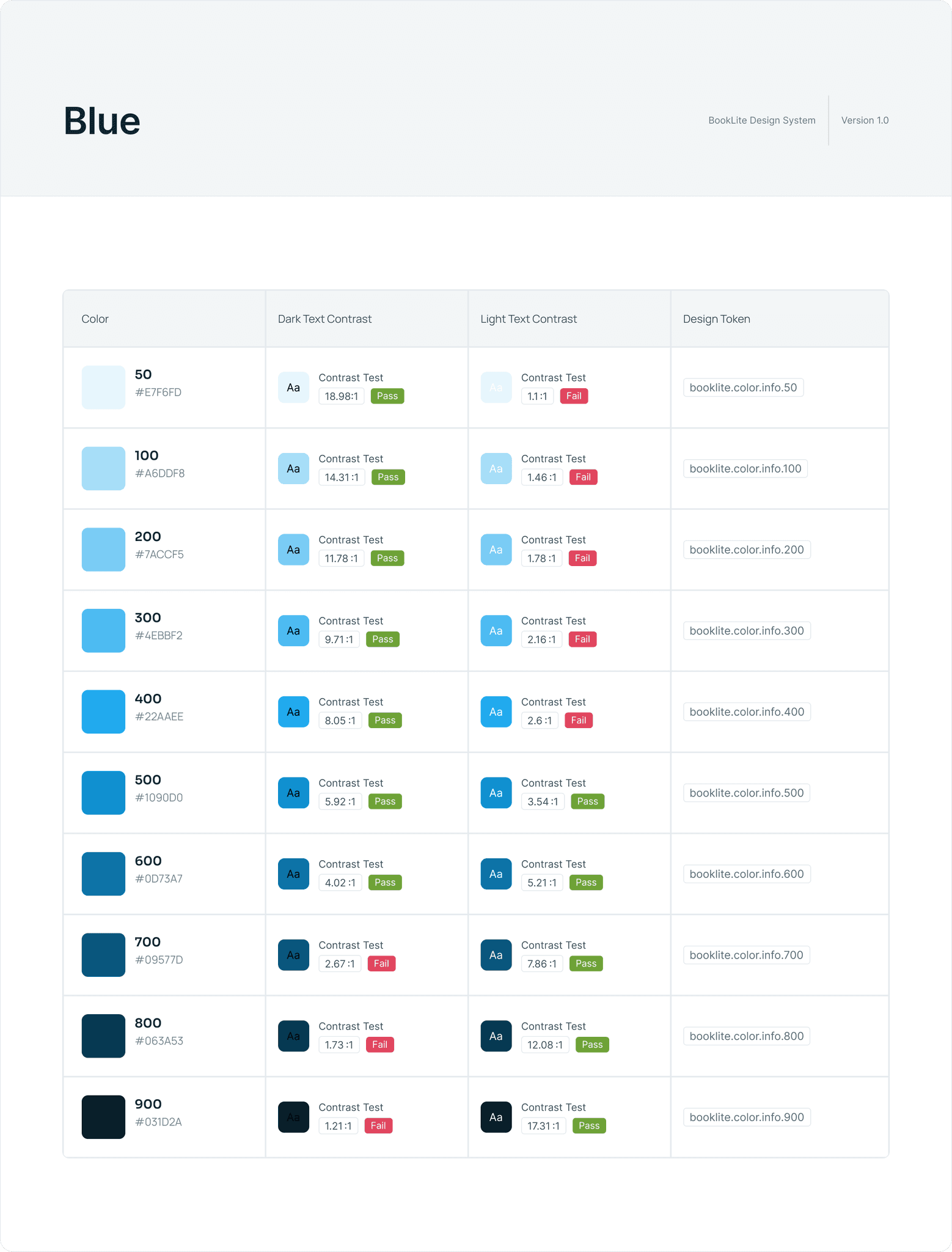
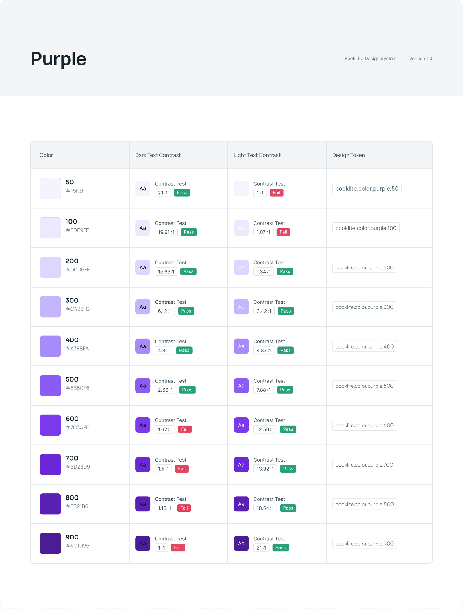
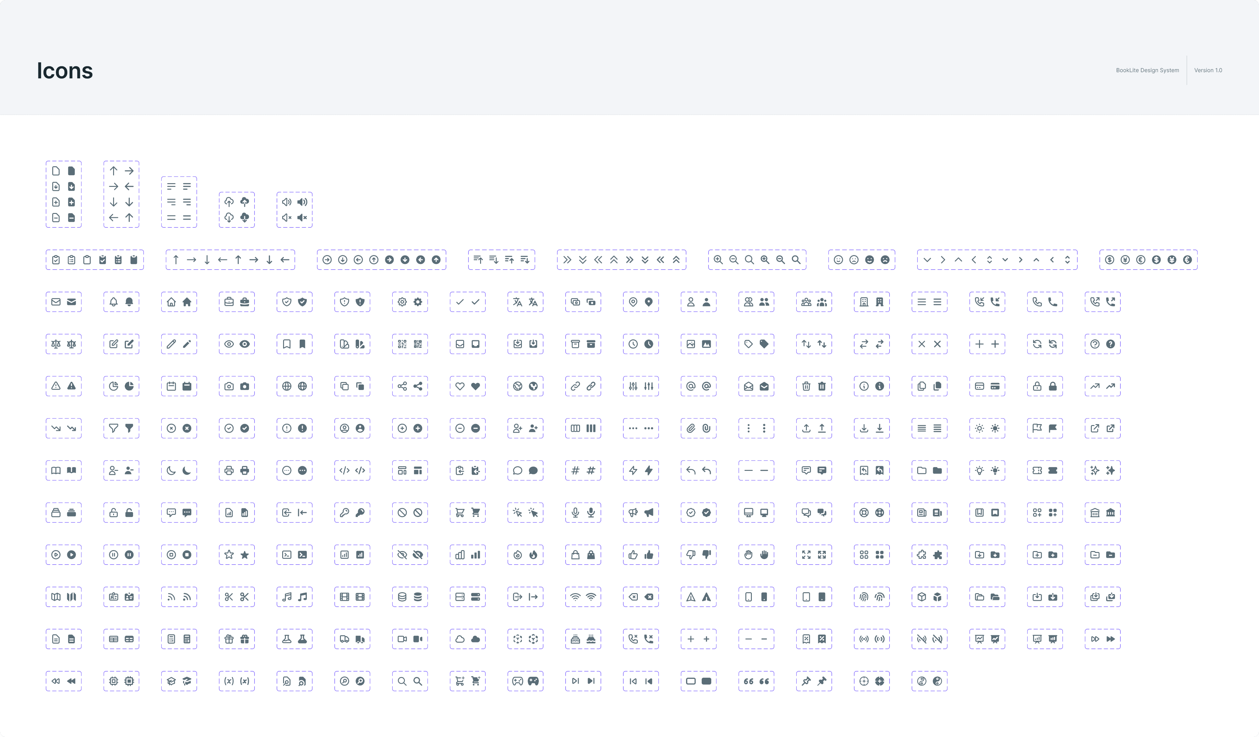
With this information, I created a very simple style guide that contains branding, a color palette, typography, and icons.
With this information, I created a very simple style guide that contains branding, a color palette, typography, and icons.
With this information, I created a very simple style guide that contains branding, a color palette, typography, and icons.
With this information, I created a very simple style guide that contains branding, a color palette, typography, and icons.
This was also true for the top ten lists, the only addition was that they had a brief introduction to the book. This I found very interesting because now the user has a way to know a bit more about the book, and it could ultimately create curiosity towards the book.
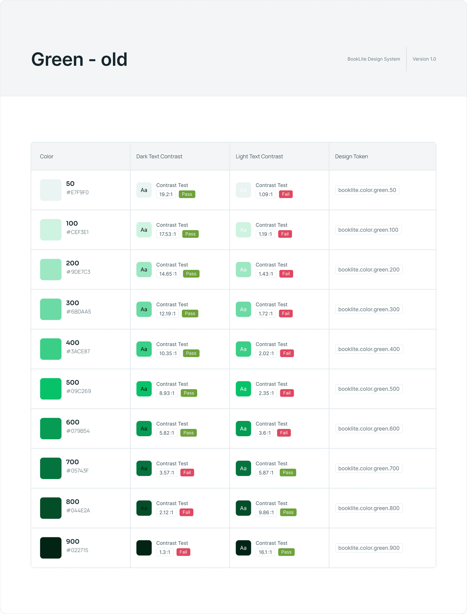
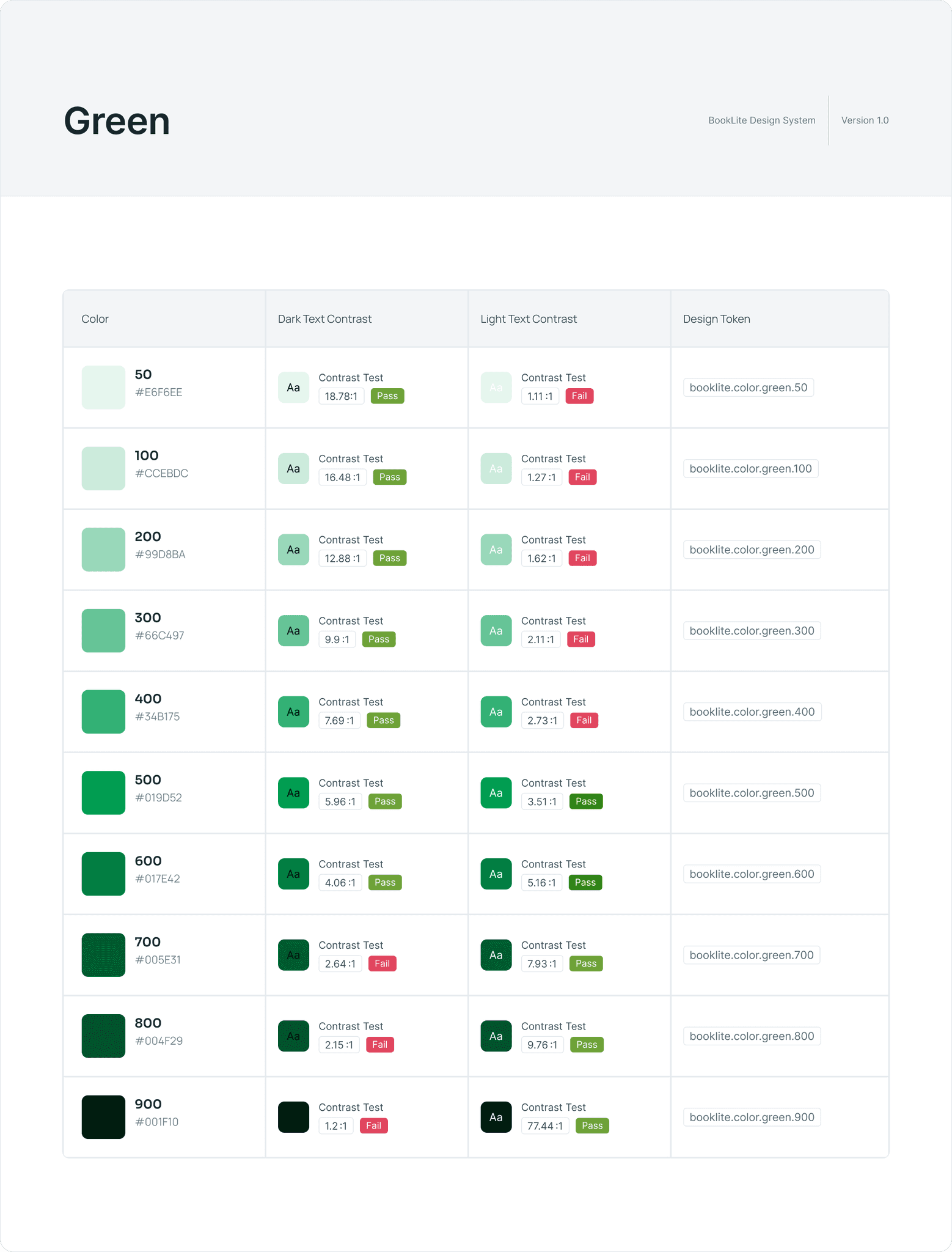
Colors
Colors
Colors
Typography
Typography
Typography
Icons & brand
Icons & brand
Icons & brand


Creating The design
Creating The design
Creating The design
Creating The design
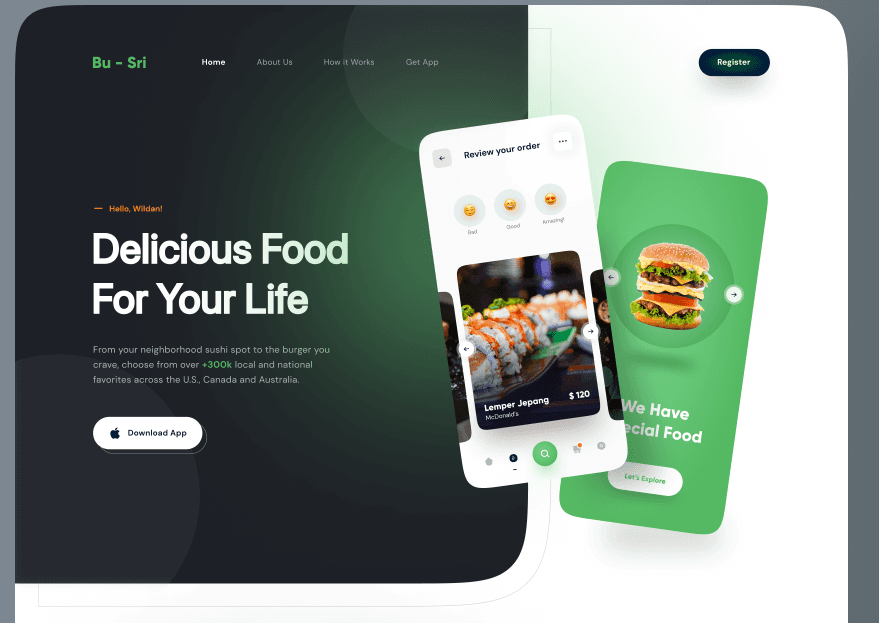
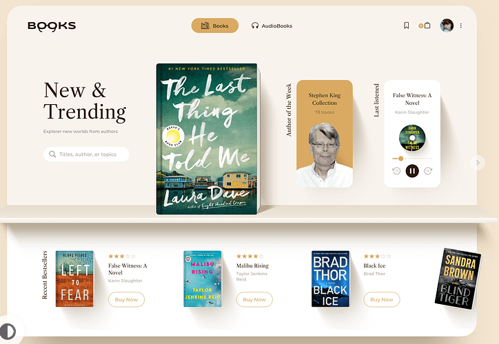
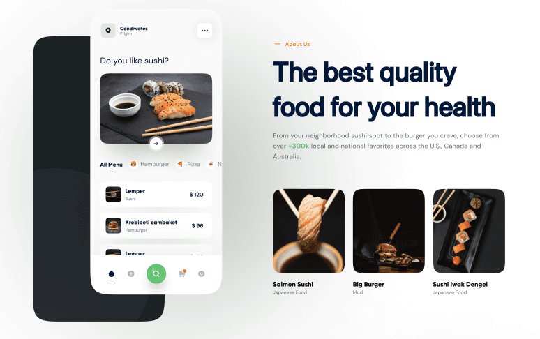
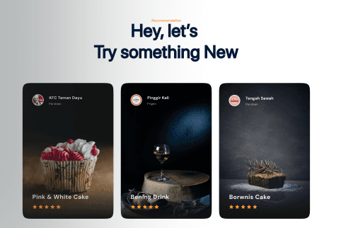
When I create a landing page, I usually tend to create a very quick moodboard from which I can draw inspiration. I searched for ideas on Dribbble, Pinterest, Behance, Awwwards, among others.
When I create a landing page, I usually tend to create a very quick moodboard from which I can draw inspiration. I searched for ideas on Dribbble, Pinterest, Behance, Awwwards, among others.
When I create a landing page, I usually tend to create a very quick moodboard from which I can draw inspiration. I searched for ideas on Dribbble, Pinterest, Behance, Awwwards, among others.
When I create a landing page, I usually tend to create a very quick moodboard from which I can draw inspiration. I searched for ideas on Dribbble, Pinterest, Behance, Awwwards, among others.
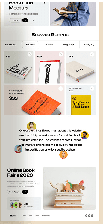
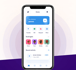
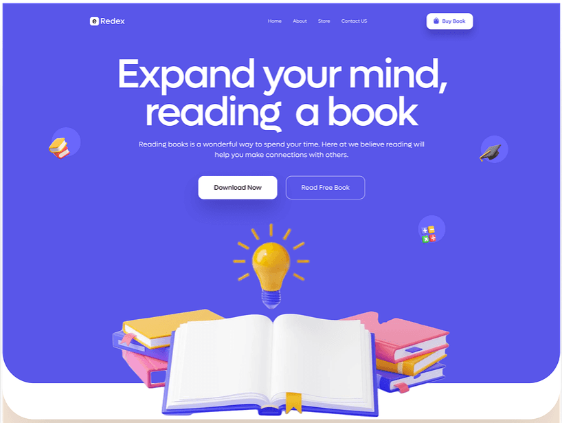
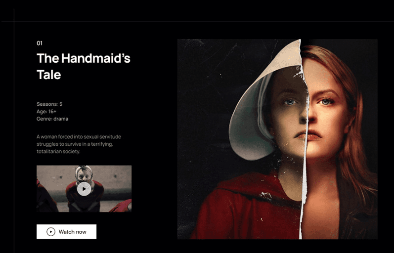
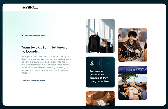
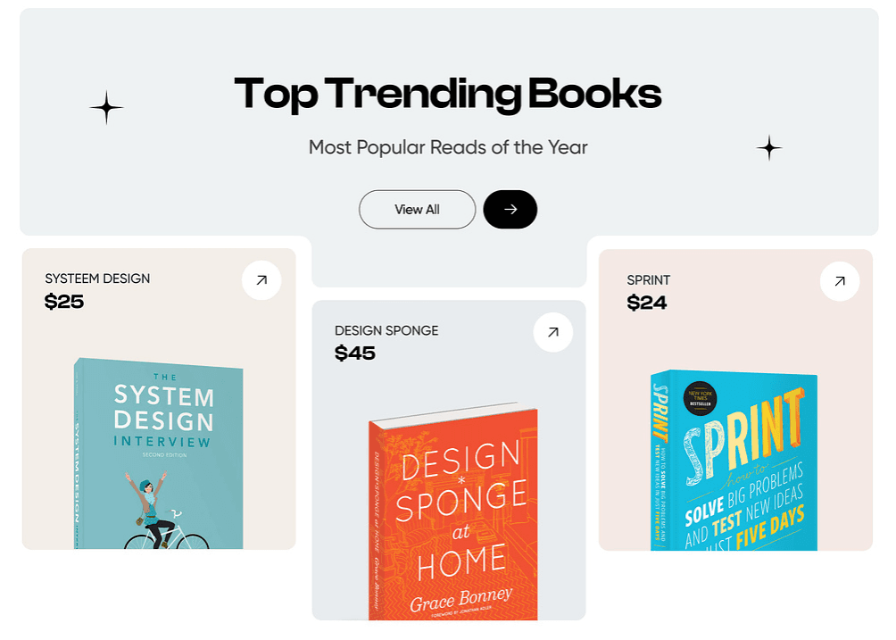
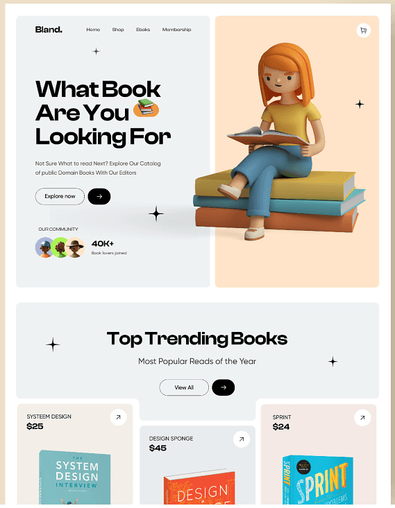
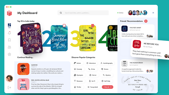

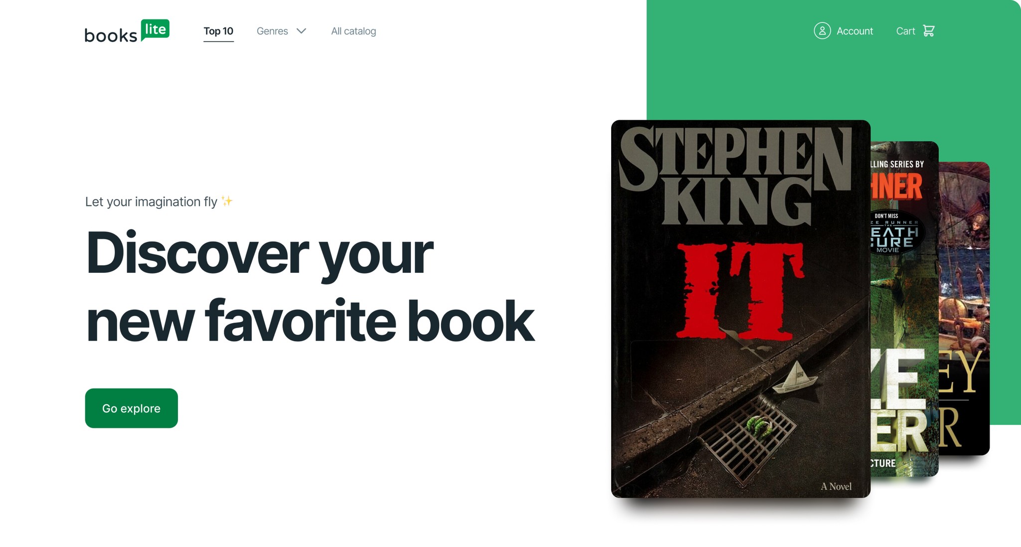
Now is the time to start with the mockups. I decided to really highlight the star of the show. In order to do that, I used the book covers and really tried to make them stand out on their own. Book covers are generally very colorful, so I took that to my advantage.
Now is the time to start with the mockups. I decided to really highlight the star of the show. In order to do that, I used the book covers and really tried to make them stand out on their own. Book covers are generally very colorful, so I took that to my advantage.
Now is the time to start with the mockups. I decided to really highlight the star of the show. In order to do that, I used the book covers and really tried to make them stand out on their own. Book covers are generally very colorful, so I took that to my advantage.
Now is the time to start with the mockups. I decided to really highlight the star of the show. In order to do that, I used the book covers and really tried to make them stand out on their own. Book covers are generally very colorful, so I took that to my advantage.
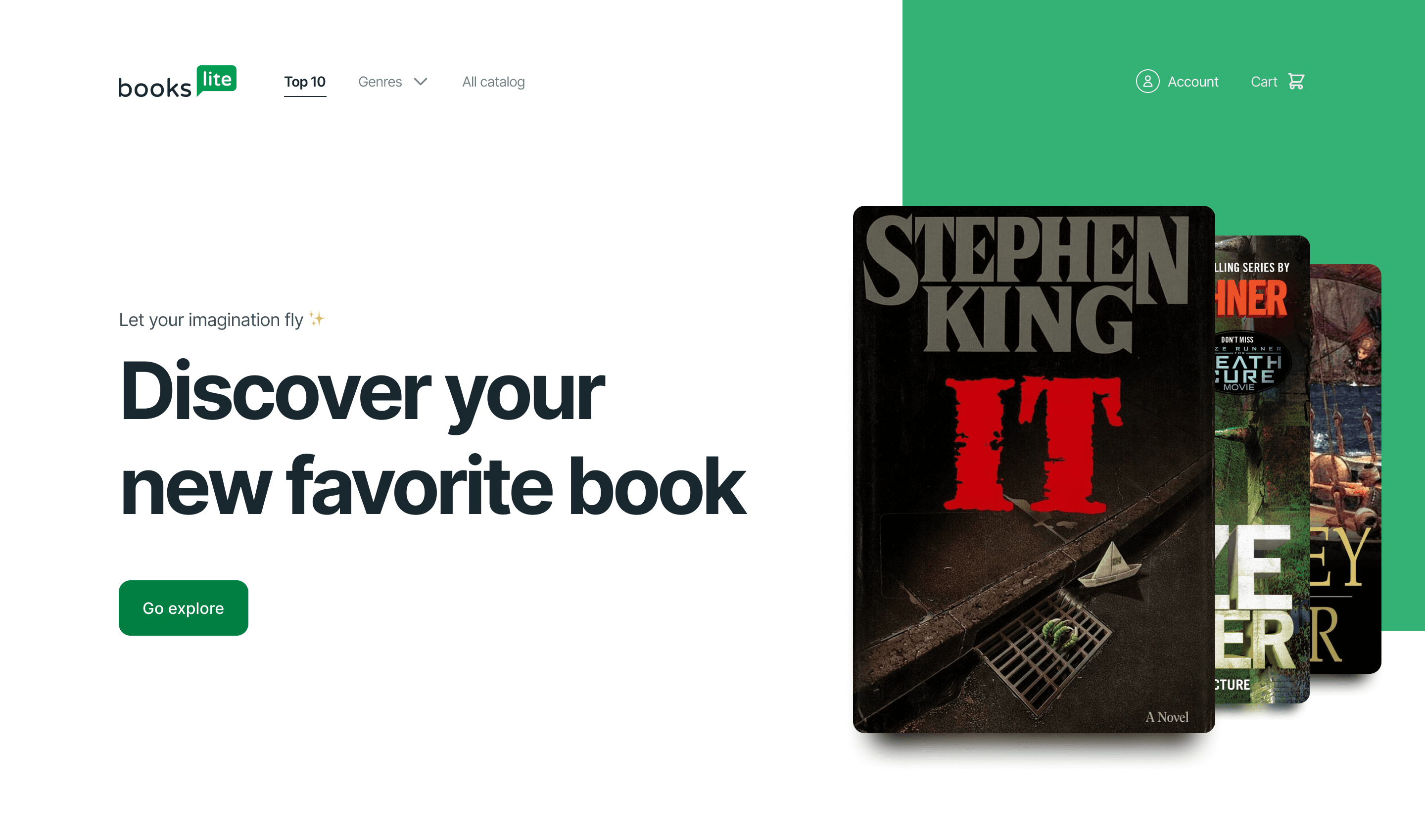
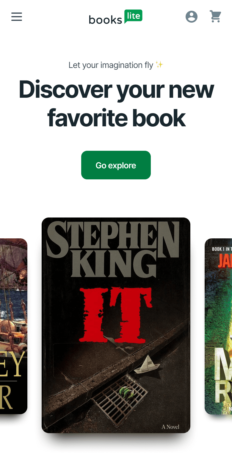
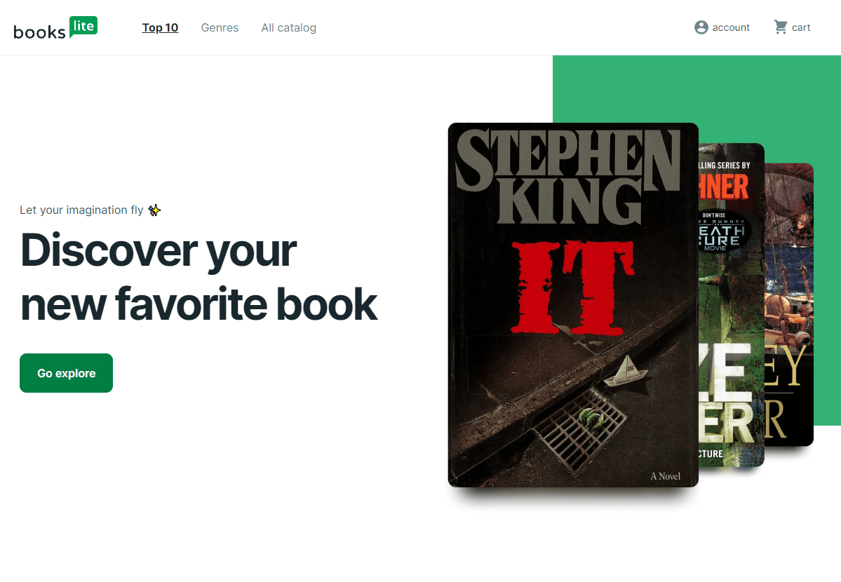
The first section was the banner. It's a very simple banner with book covers as the graphic and a title that tells you that it is more than just a top ten of my favorite books, it's a place where you can potentially find your new favorite book.
The first section was the banner. It's a very simple banner with book covers as the graphic and a title that tells you that it is more than just a top ten of my favorite books, it's a place where you can potentially find your new favorite book.
The first section was the banner. It's a very simple banner with book covers as the graphic and a title that tells you that it is more than just a top ten of my favorite books, it's a place where you can potentially find your new favorite book.
The first section was the banner. It's a very simple banner with book covers as the graphic and a title that tells you that it is more than just a top ten of my favorite books, it's a place where you can potentially find your new favorite book.


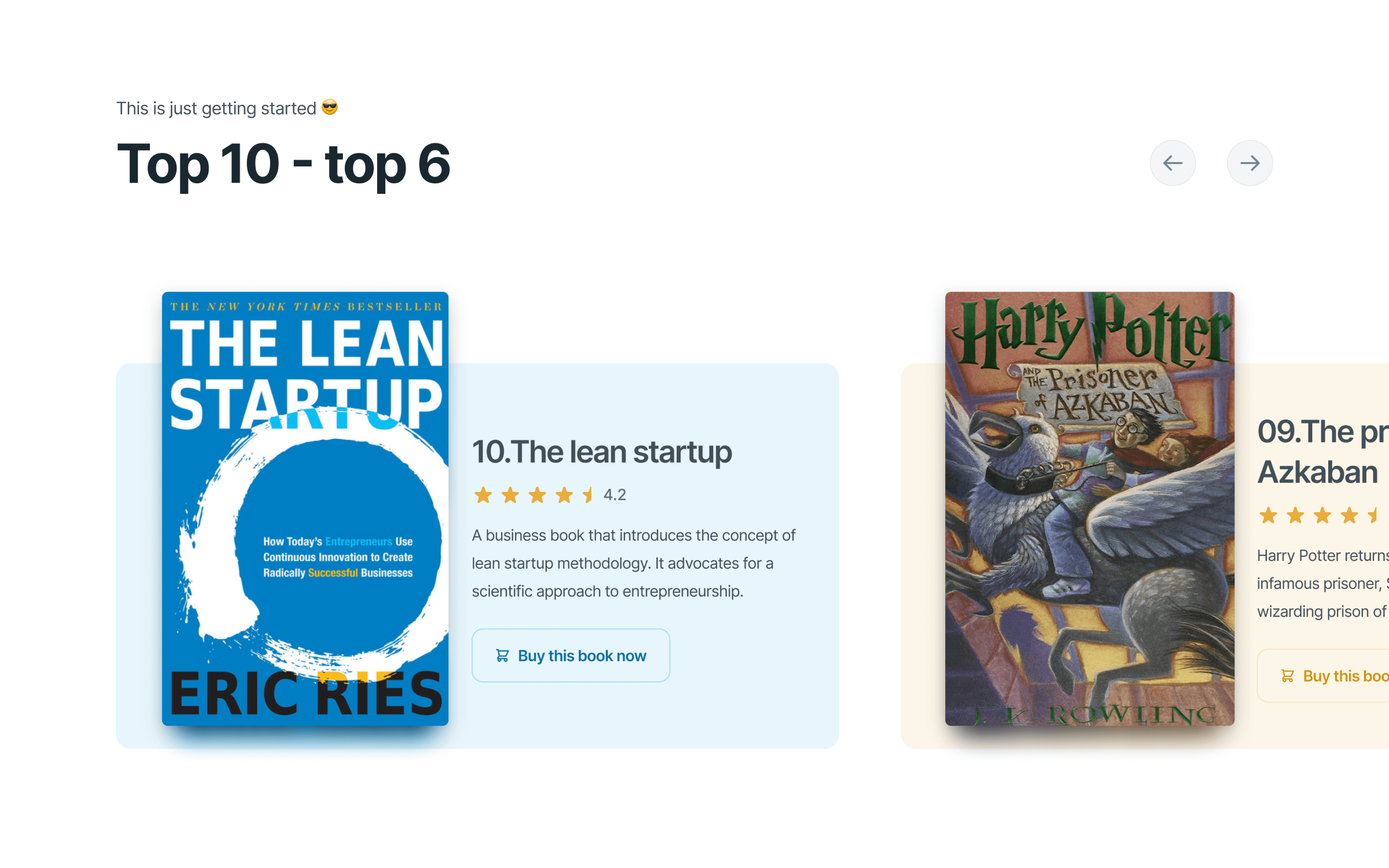
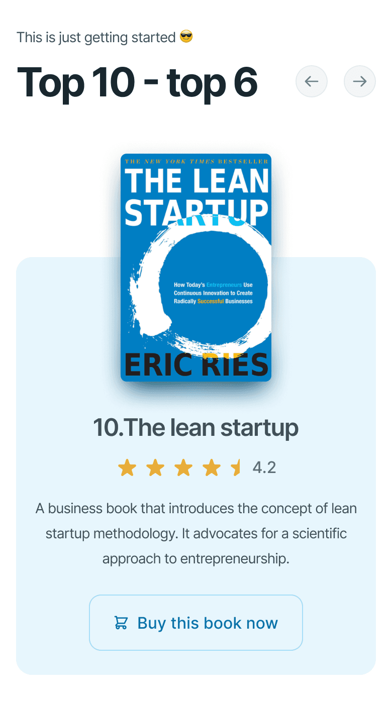
I really wanted to save the best books for last, so the user is encouraged to keep scrolling. That's why the next section is a carousel of the bottom 5 books on the list. Initially, I wanted to display all the books individually in their own section, but it made the page unnecessarily long, and the user would’ve felt overwhelmed.
I really wanted to save the best books for last, so the user is encouraged to keep scrolling. That's why the next section is a carousel of the bottom 5 books on the list. Initially, I wanted to display all the books individually in their own section, but it made the page unnecessarily long, and the user would’ve felt overwhelmed.
I really wanted to save the best books for last, so the user is encouraged to keep scrolling. That's why the next section is a carousel of the bottom 5 books on the list. Initially, I wanted to display all the books individually in their own section, but it made the page unnecessarily long, and the user would’ve felt overwhelmed.
I really wanted to save the best books for last, so the user is encouraged to keep scrolling. That's why the next section is a carousel of the bottom 5 books on the list. Initially, I wanted to display all the books individually in their own section, but it made the page unnecessarily long, and the user would’ve felt overwhelmed.


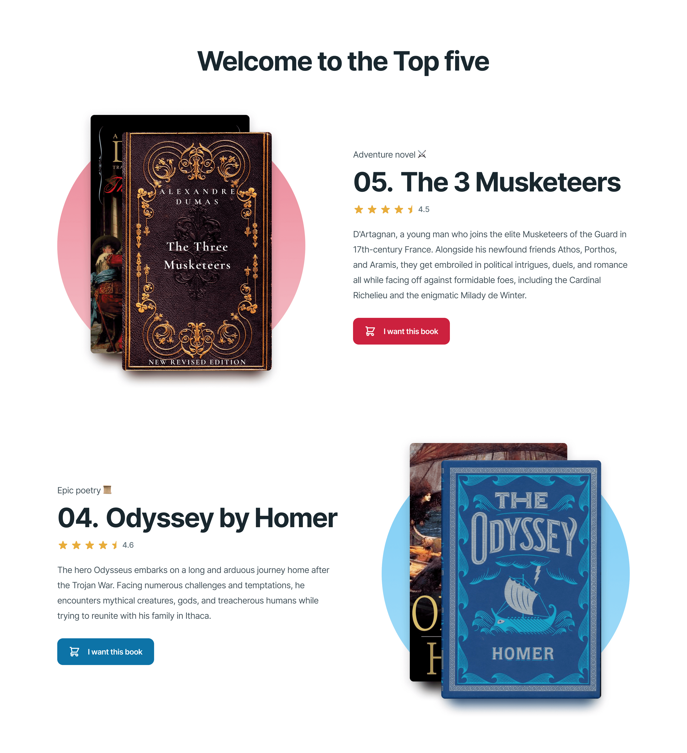
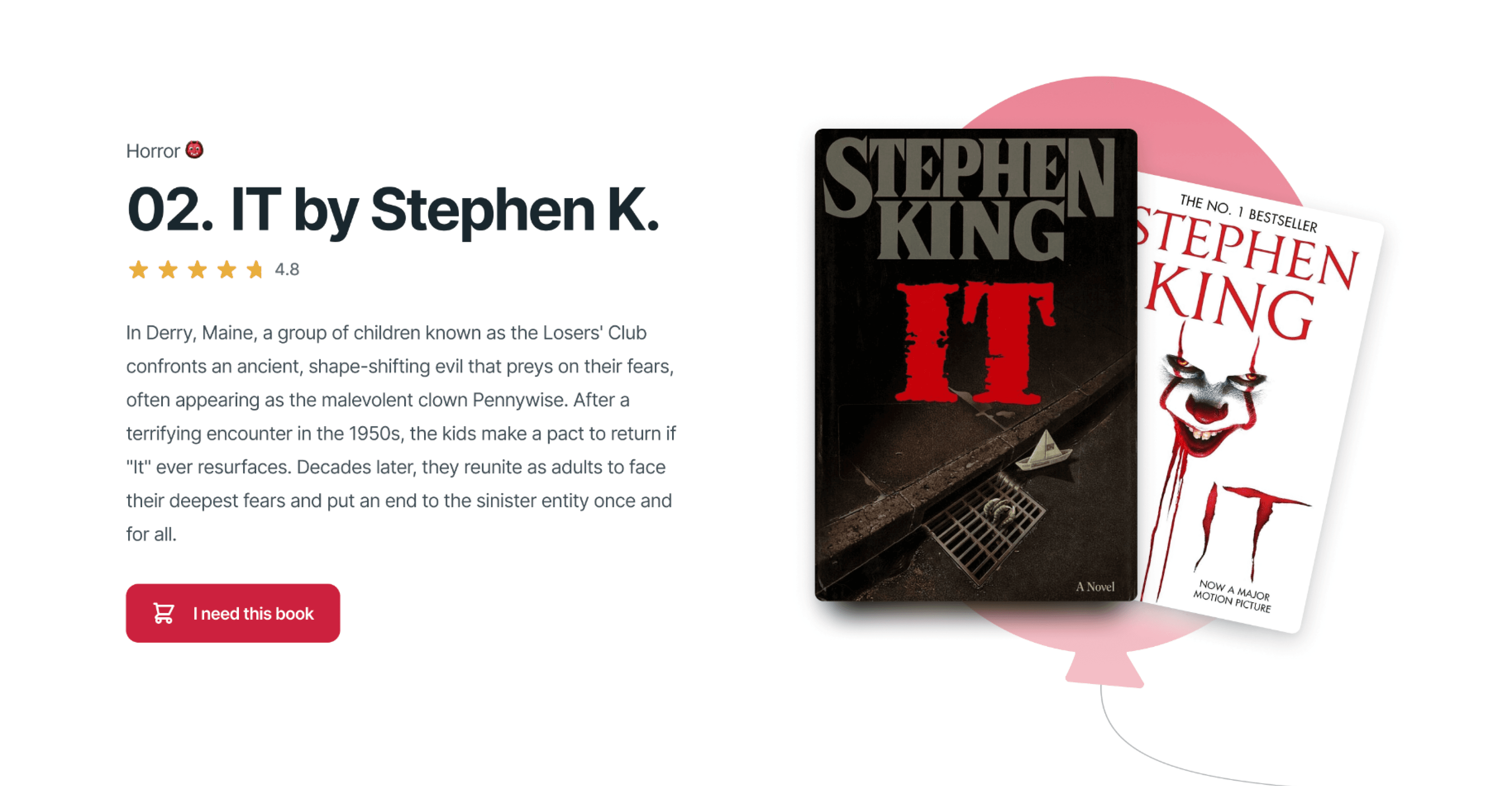
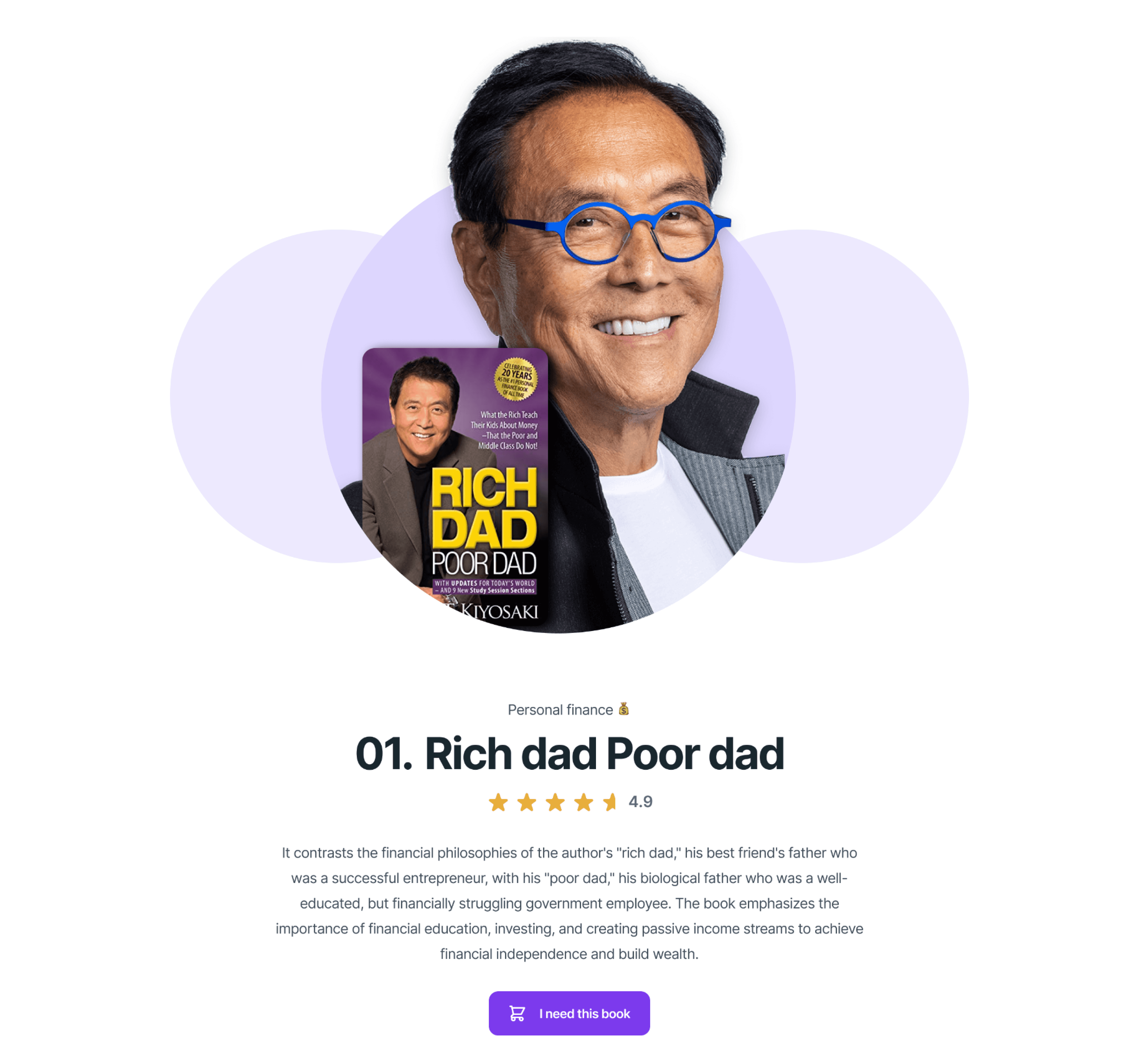
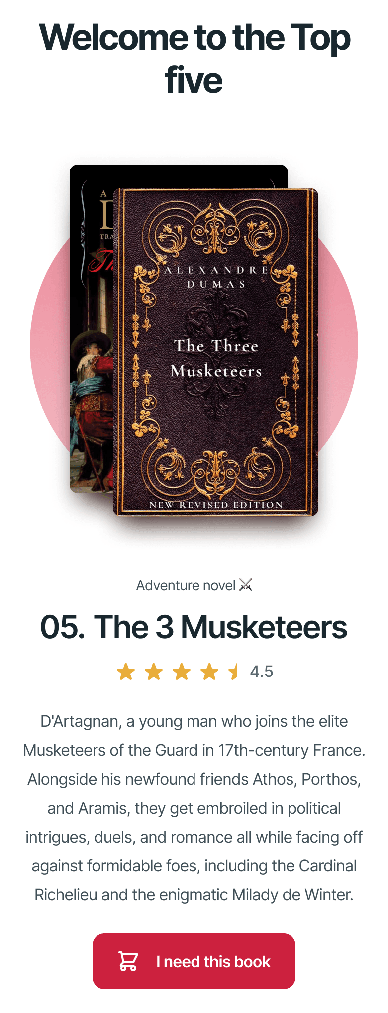
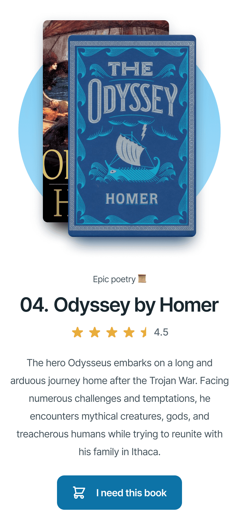
Afterward, we jump into the top five. From here on out, each book has its own section, and each element was displayed in a big way to generate impact on the user and encourage them to take their time reading about each book in the top 5.
Afterward, we jump into the top five. From here on out, each book has its own section, and each element was displayed in a big way to generate impact on the user and encourage them to take their time reading about each book in the top 5.
Afterward, we jump into the top five. From here on out, each book has its own section, and each element was displayed in a big way to generate impact on the user and encourage them to take their time reading about each book in the top 5.
Afterward, we jump into the top five. From here on out, each book has its own section, and each element was displayed in a big way to generate impact on the user and encourage them to take their time reading about each book in the top 5.


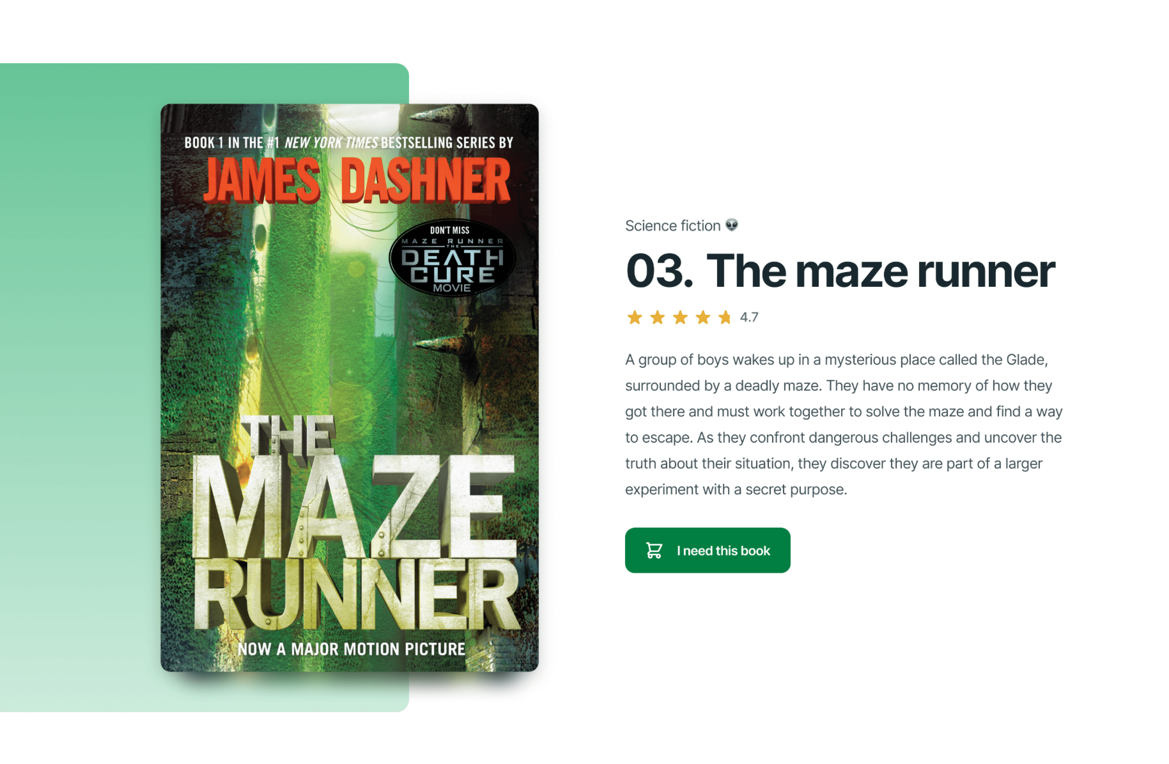
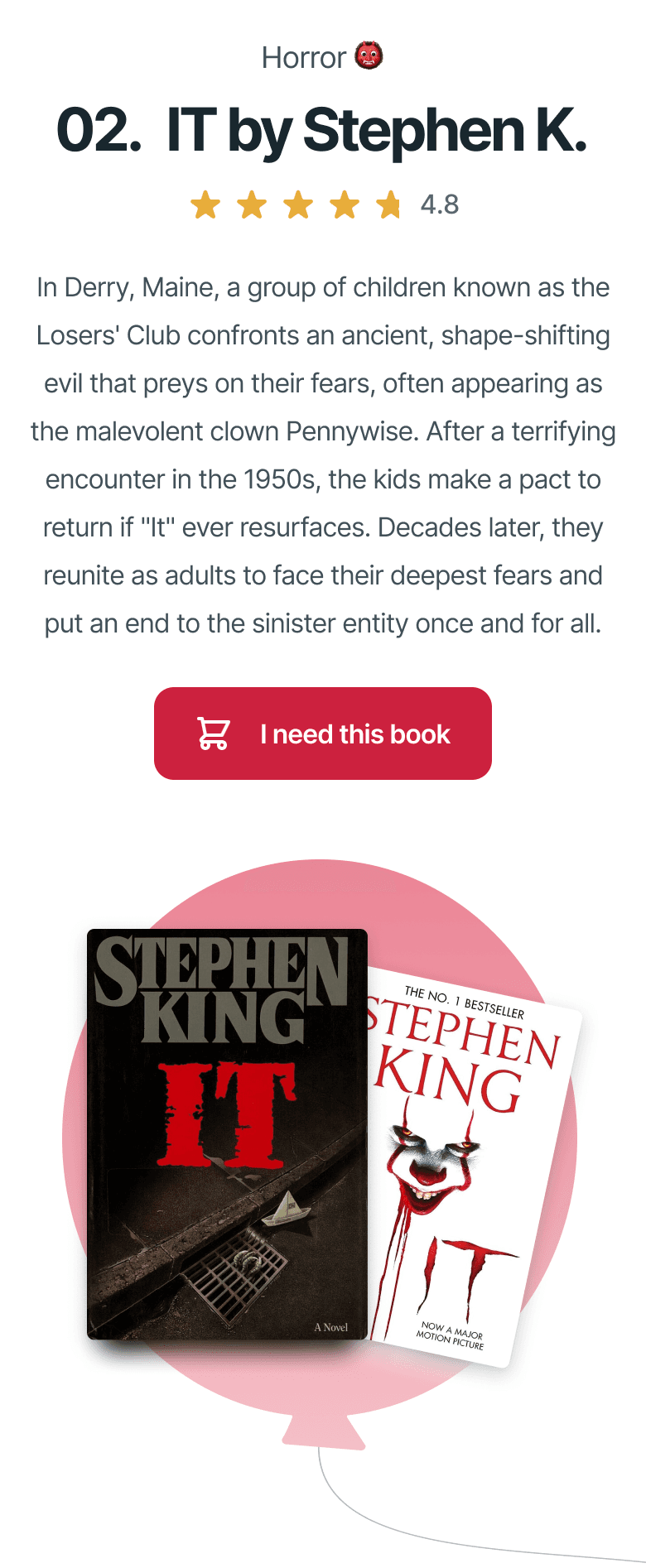
For the top three, I opted to add a special visual aid that not only had the color of the cover like the others, but had a special shape that resembled something about the book. My favorite one was the balloon from It, it’s a very recognizable item from the book.
For the top three, I opted to add a special visual aid that not only had the color of the cover like the others, but had a special shape that resembled something about the book. My favorite one was the balloon from It, it’s a very recognizable item from the book.
For the top three, I opted to add a special visual aid that not only had the color of the cover like the others, but had a special shape that resembled something about the book. My favorite one was the balloon from It, it’s a very recognizable item from the book.
For the top three, I opted to add a special visual aid that not only had the color of the cover like the others, but had a special shape that resembled something about the book. My favorite one was the balloon from It, it’s a very recognizable item from the book.






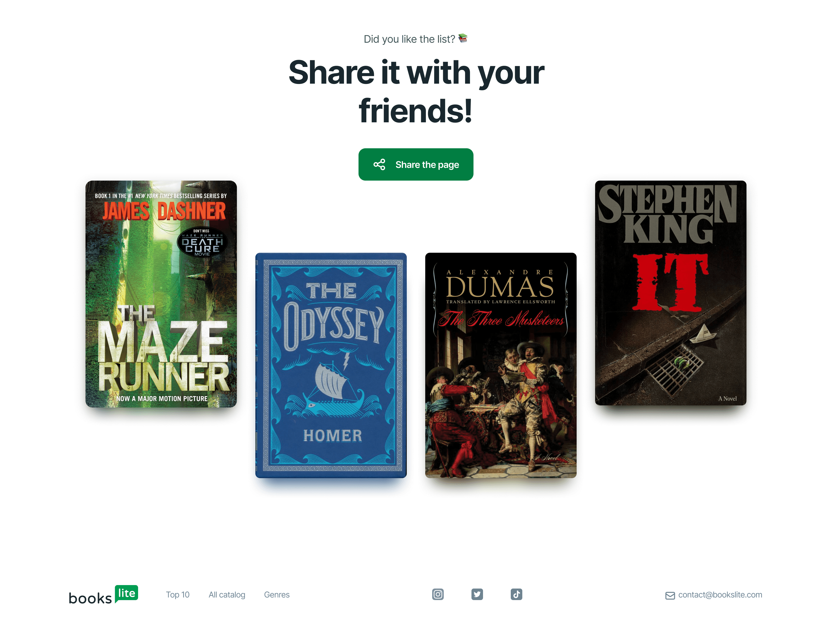
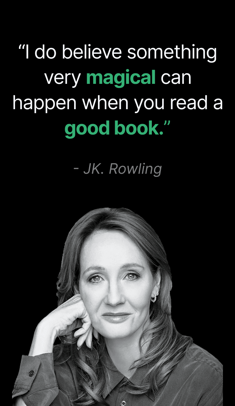
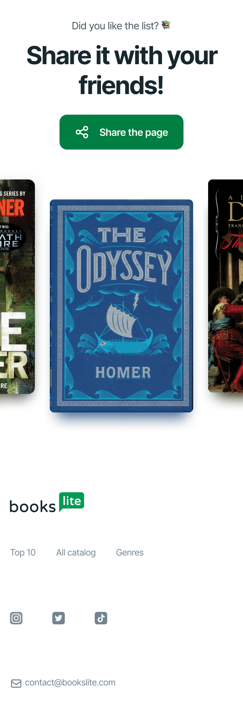
We close the page with a CTA section, the intention is to make the user share the page with their friends so that they potentially enter the site, get interested in a book, and ultimately buy the book.
We close the page with a CTA section, the intention is to make the user share the page with their friends so that they potentially enter the site, get interested in a book, and ultimately buy the book.
We close the page with a CTA section, the intention is to make the user share the page with their friends so that they potentially enter the site, get interested in a book, and ultimately buy the book.
We close the page with a CTA section, the intention is to make the user share the page with their friends so that they potentially enter the site, get interested in a book, and ultimately buy the book.


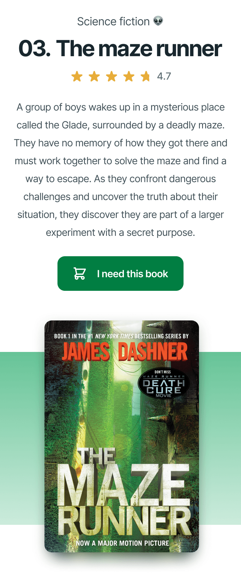
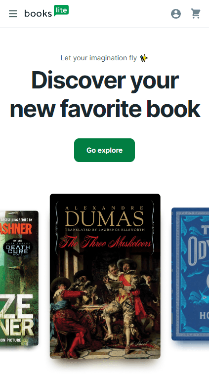
A thing that is sometimes overlooked but is very important for the development stages of a website. It is to design a mobile version of the website, so the developers involved can see how the design is meant to look on mobile devices and therefore have a much easier time coding the website.
A thing that is sometimes overlooked but is very important for the development stages of a website. It is to design a mobile version of the website, so the developers involved can see how the design is meant to look on mobile devices and therefore have a much easier time coding the website.
A thing that is sometimes overlooked but is very important for the development stages of a website. It is to design a mobile version of the website, so the developers involved can see how the design is meant to look on mobile devices and therefore have a much easier time coding the website.
A thing that is sometimes overlooked but is very important for the development stages of a website. It is to design a mobile version of the website, so the developers involved can see how the design is meant to look on mobile devices and therefore have a much easier time coding the website.









03
03
03
03
/
/
/
/
development
development
development
development
Bring the design to life
Bring the design to life
Bring the design to life
Bring the design to life
As the challenge stated, the entire website was coded on nothing but vanilla technologies: HTML, CSS and JavaScript.
As the challenge stated, the entire website was coded on nothing but vanilla technologies: HTML, CSS and JavaScript.
As the challenge stated, the entire website was coded on nothing but vanilla technologies: HTML, CSS and JavaScript.
As the challenge stated, the entire website was coded on nothing but vanilla technologies: HTML, CSS and JavaScript.
In order to have the best coding experience, it's essential to get things organized. So the first step is to create the project's base structure.
In order to have the best coding experience, it's essential to get things organized. So the first step is to create the project's base structure.
In order to have the best coding experience, it's essential to get things organized. So the first step is to create the project's base structure.
In order to have the best coding experience, it's essential to get things organized. So the first step is to create the project's base structure.
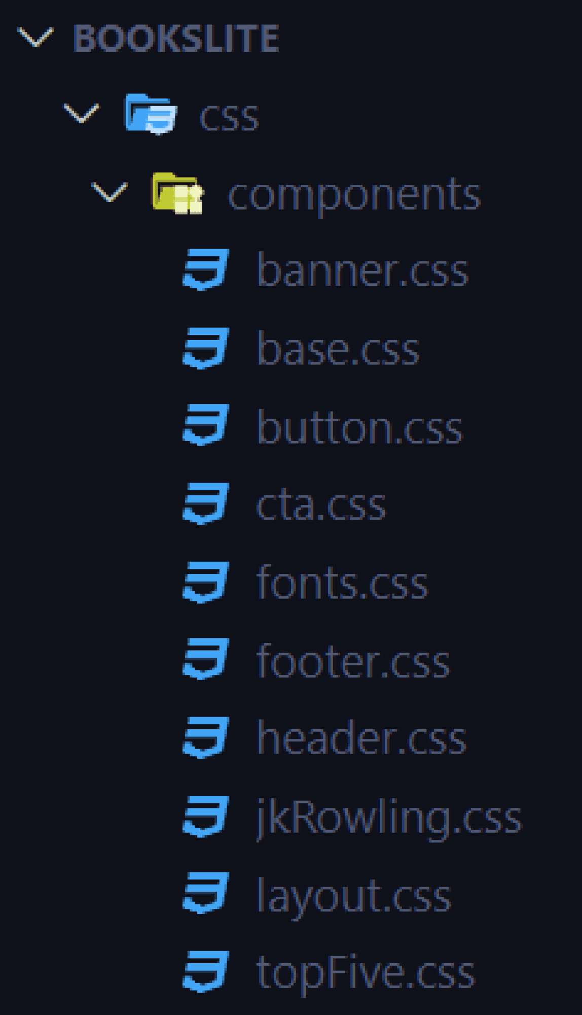
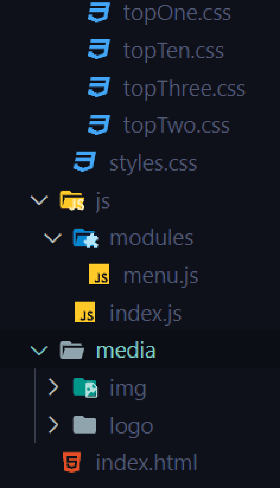
There is something that I would like to point out. I imported styles sheets like you would on Sass. This is a bad practice in vanilla CSS because the performance of the website takes a significant drop. However, since this is not a real project, I decided to do it this way because it's better for readability and for the purpose of the challenge.
There is something that I would like to point out. I imported styles sheets like you would on Sass. This is a bad practice in vanilla CSS because the performance of the website takes a significant drop. However, since this is not a real project, I decided to do it this way because it's better for readability and for the purpose of the challenge.
I prefer to create websites using the mobile-frist approach. Using a mobile-first approach in web development can provide several advantages, such as improved user experience due to increased navigability, readability, and interactivity on mobile devices. Additionally, it reduces the number of code, images, and resources that need to be loaded on mobile devices, improving loading speed, responsiveness, and battery life.
I prefer to create websites using the mobile-frist approach. Using a mobile-first approach in web development can provide several advantages, such as improved user experience due to increased navigability, readability, and interactivity on mobile devices. Additionally, it reduces the number of code, images, and resources that need to be loaded on mobile devices, improving loading speed, responsiveness, and battery life.
I prefer to create websites using the mobile-frist approach. Using a mobile-first approach in web development can provide several advantages, such as improved user experience due to increased navigability, readability, and interactivity on mobile devices. Additionally, it reduces the number of code, images, and resources that need to be loaded on mobile devices, improving loading speed, responsiveness, and battery life.
I prefer to create websites using the mobile-frist approach. Using a mobile-first approach in web development can provide several advantages, such as improved user experience due to increased navigability, readability, and interactivity on mobile devices. Additionally, it reduces the number of code, images, and resources that need to be loaded on mobile devices, improving loading speed, responsiveness, and battery life.
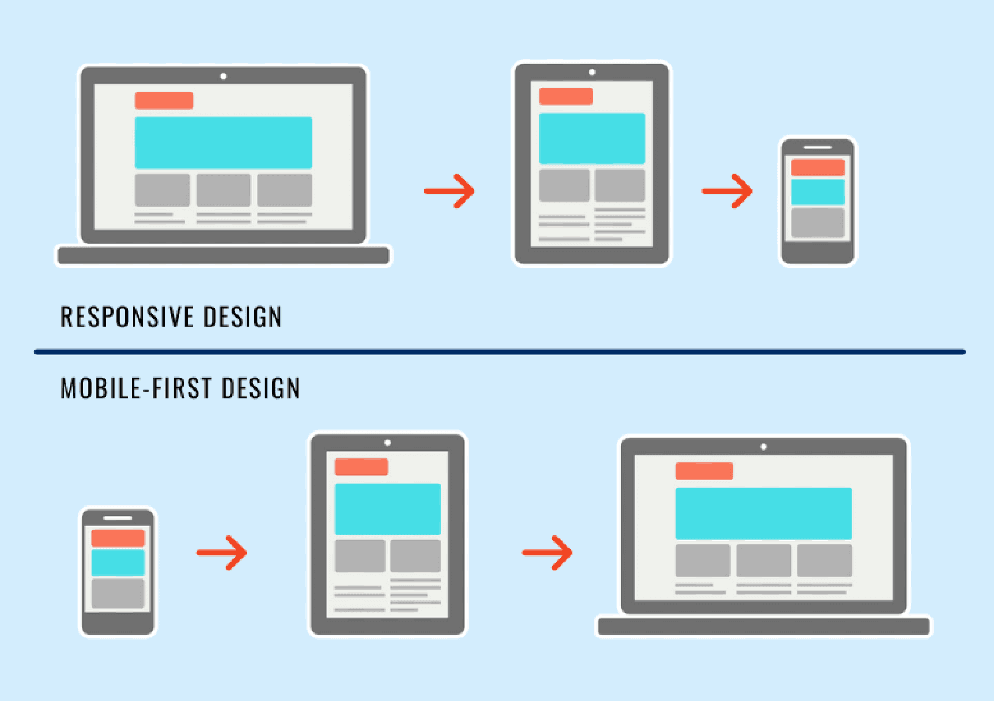
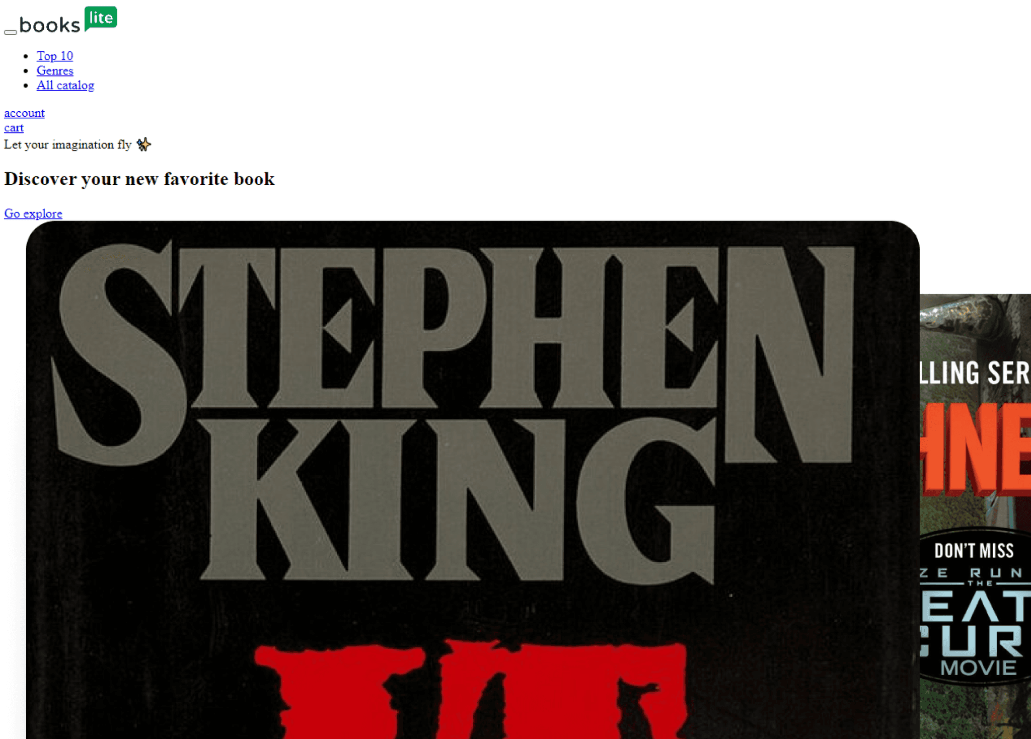
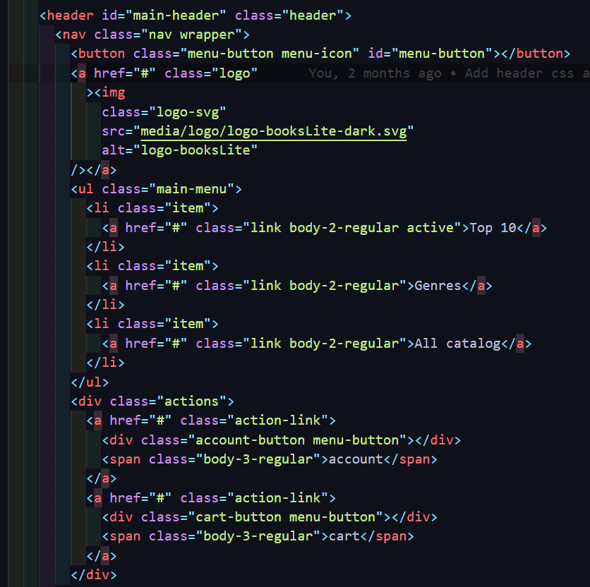
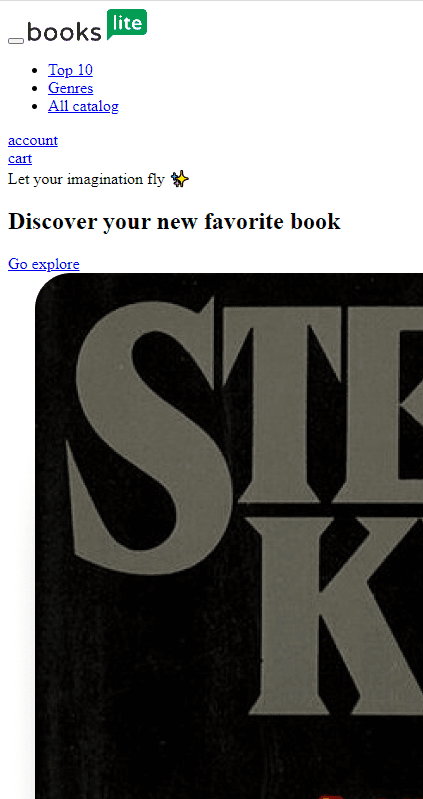
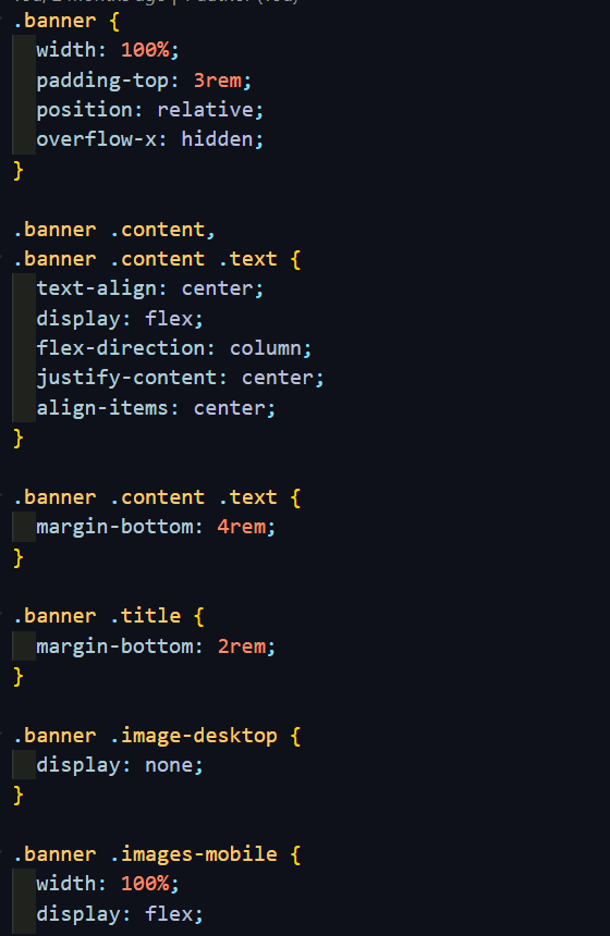
So having that in mind, I first coded all the HTML code that works for both mobile, tablet and desktop. Then I wrote CSS code based on components, started with the mobile version, and scaled up to the desktop version.
So having that in mind, I first coded all the HTML code that works for both mobile, tablet and desktop. Then I wrote CSS code based on components, started with the mobile version, and scaled up to the desktop version.
So having that in mind, I first coded all the HTML code that works for both mobile, tablet and desktop. Then I wrote CSS code based on components, started with the mobile version, and scaled up to the desktop version.
So having that in mind, I first coded all the HTML code that works for both mobile, tablet and desktop. Then I wrote CSS code based on components, started with the mobile version, and scaled up to the desktop version.
HTML
HTML
HTML

CSS
CSS
CSS





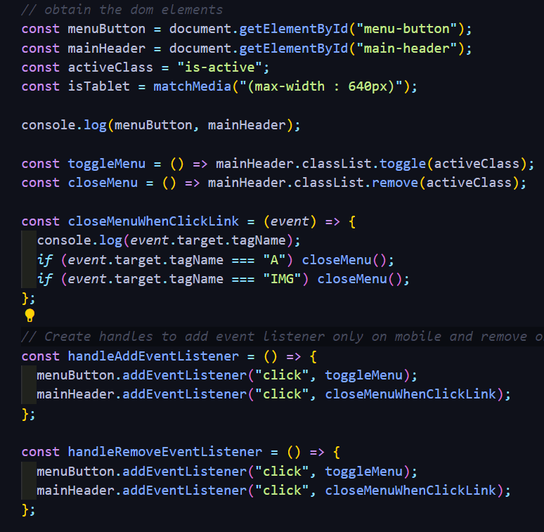
Finally, I added a little JavaScript to create some interactions and animations. An example is the menu for the mobile version.
Finally, I added a little JavaScript to create some interactions and animations. An example is the menu for the mobile version.
Finally, I added a little JavaScript to create some interactions and animations. An example is the menu for the mobile version.
Finally, I added a little JavaScript to create some interactions and animations. An example is the menu for the mobile version.
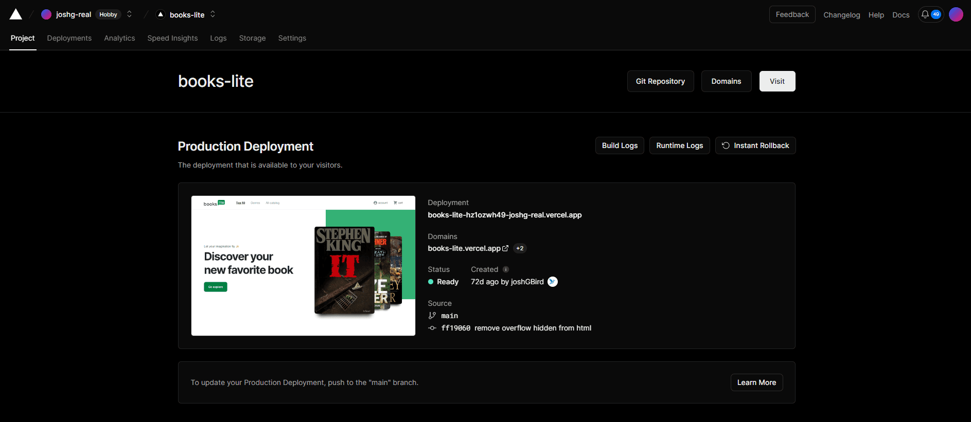
The project is hosted in a GitHub repository. The challenge stated that the final result had to be on a platform of my choice. I decided to host it on Vercel since it's a Web hosting service that I'm familiar with.
The project is hosted in a GitHub repository. The challenge stated that the final result had to be on a platform of my choice. I decided to host it on Vercel since it's a Web hosting service that I'm familiar with.
The project is hosted in a GitHub repository. The challenge stated that the final result had to be on a platform of my choice. I decided to host it on Vercel since it's a Web hosting service that I'm familiar with.
The project is hosted in a GitHub repository. The challenge stated that the final result had to be on a platform of my choice. I decided to host it on Vercel since it's a Web hosting service that I'm familiar with.
If you wish to see the code for this project, I'll attach a link to the GitHub repository. Link to the website.
If you wish to see the code for this project, I'll attach a link to the GitHub repository.
The results of the project were delivered to the recruiter via email. I delivered four links: the first one is to the Figma project; the second link is to the GitHub repository; the third is a Vercel link where the page is hosted; and finally, a link to a video explaining my decisions (a Vimeo link).
The results of the project were delivered to the recruiter via email. I delivered four links: the first one is to the Figma project; the second link is to the GitHub repository; the third is a Vercel link where the page is hosted; and finally, a link to a video explaining my decisions (a Vimeo link).
The results of the project were delivered to the recruiter via email. I delivered four links: the first one is to the Figma project; the second link is to the GitHub repository; the third is a Vercel link where the page is hosted; and finally, a link to a video explaining my decisions (a Vimeo link).
The results of the project were delivered to the recruiter via email. I delivered four links: the first one is to the Figma project; the second link is to the GitHub repository; the third is a Vercel link where the page is hosted; and finally, a link to a video explaining my decisions (a Vimeo link).
